Data Graphics in Visio Professional (and Premium) are a great way of surfacing the information in each shape, but it can be easy to forget what the Color By Value, Icon Sets or Data-bars represent:
Data Graphics in Visio Professional (and Premium) are a great way of surfacing the information in each shape, but it can be easy to forget what the Color By Value, Icon Sets or Data-bars represent:
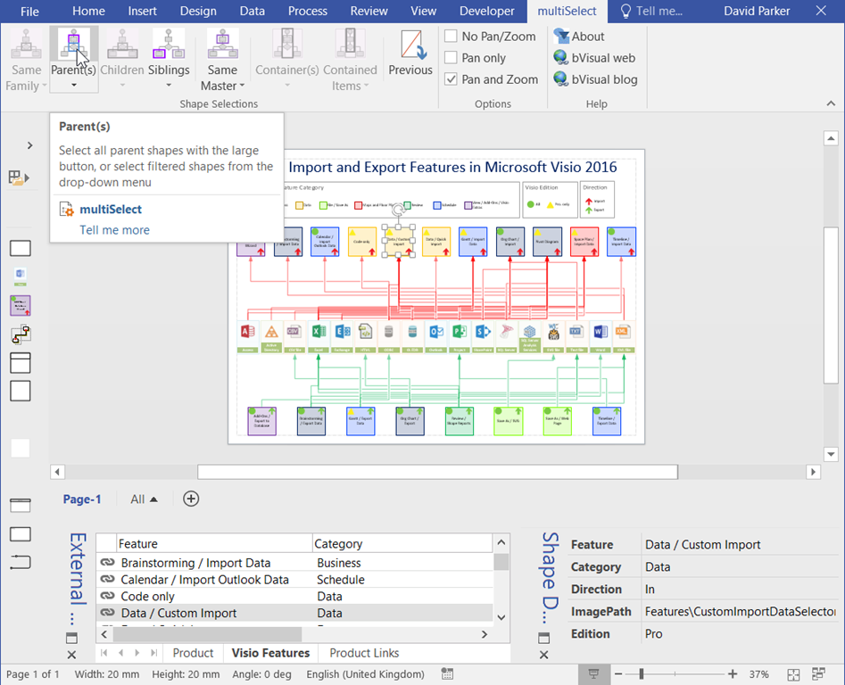
I have had some comments that the diagram in my previous post ( see http://blog.bvisual.net/2015/11/16/data-import-and-export-features-in-visio-2016-and-2013/ ) was a little hard to follow. May I suggest my free multiSelect add-in can help? ( see http://blog.bvisual.net/2012/07/20/multiple-selection-methods-for-visio-diagrams/ ).
In the following screenshot from Visio 2016 with multiSelect installed, I have selected the Data \ Custom Import feature shape. This makes the multiSelect ribbon tab visible, and I have ticked Options \ Pan and Zoom, and I am about to click the Shape Selection \ Parents button.
I will be venturing to the dark side of the moon on Saturday 12th September 2015 at SQL Saturday in Cambridge, UK ( see http://www.sqlsaturday.com/411/EventHome.aspx ).

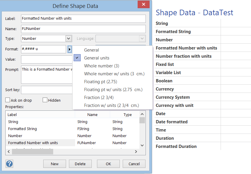
One of the best aspects of Visio is the ability of shapes to hold data, and the easiest way to do this is to define rows of Shape Data. Each row can be defined as holding one of eight different types, and most of these can have their values formatted for display. In this article I discuss the formatting of these values, using either ShapeSheet functions or automation methods. The driver for this is my on-going frustration with the Microsoft provided standard Shape Data window because of its shortcomings … for example, its lack of multi-line support even though it can hold 64k characters in each row, and its lack of a time control, even though it can store dates and time.
Visio supports Microsoft Office themes with their variants, and I have been experimenting with their affect on data graphics, so I thought I would create a document with examples of each theme applied to some data graphics. I would hesitate before using some of these, but it is interesting to see the appearance of each.

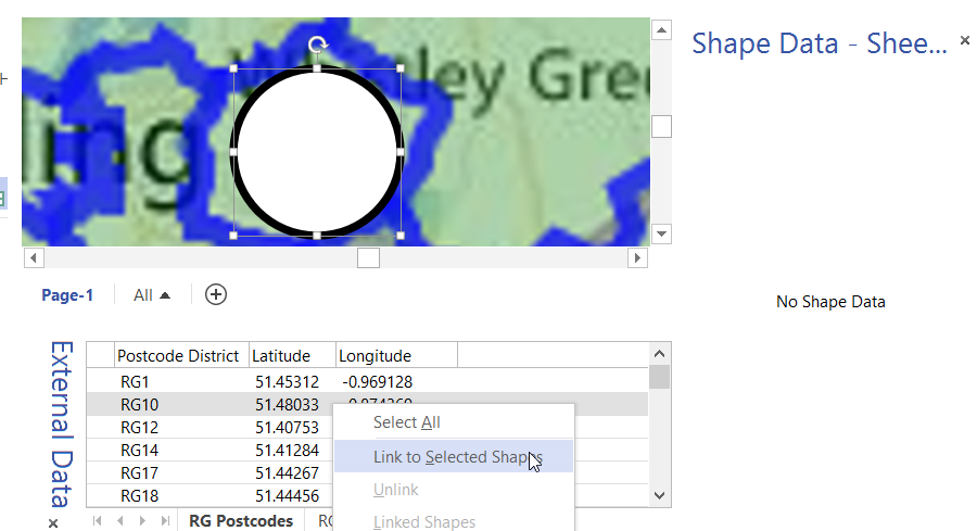
In my last article, I described how to calibrate a map in Visio ( see http://blog.bvisual.net/2015/05/26/calibrating-a-map-in-visio/ ), and in this article I use a calibrated map to distribute data points from a linked data source automatically.
For this example, I drew a simple shape at the size that I want, but you could add this smartness to any shape. All you need is an external data recordset that contains the Latitude and Longitude values that need to be linked to each data point.