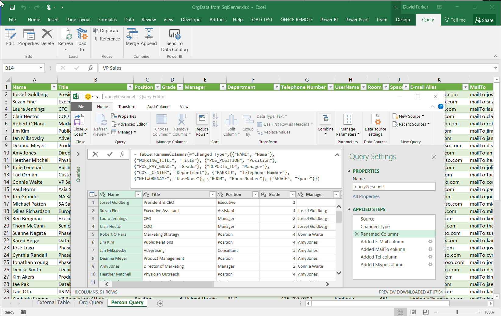
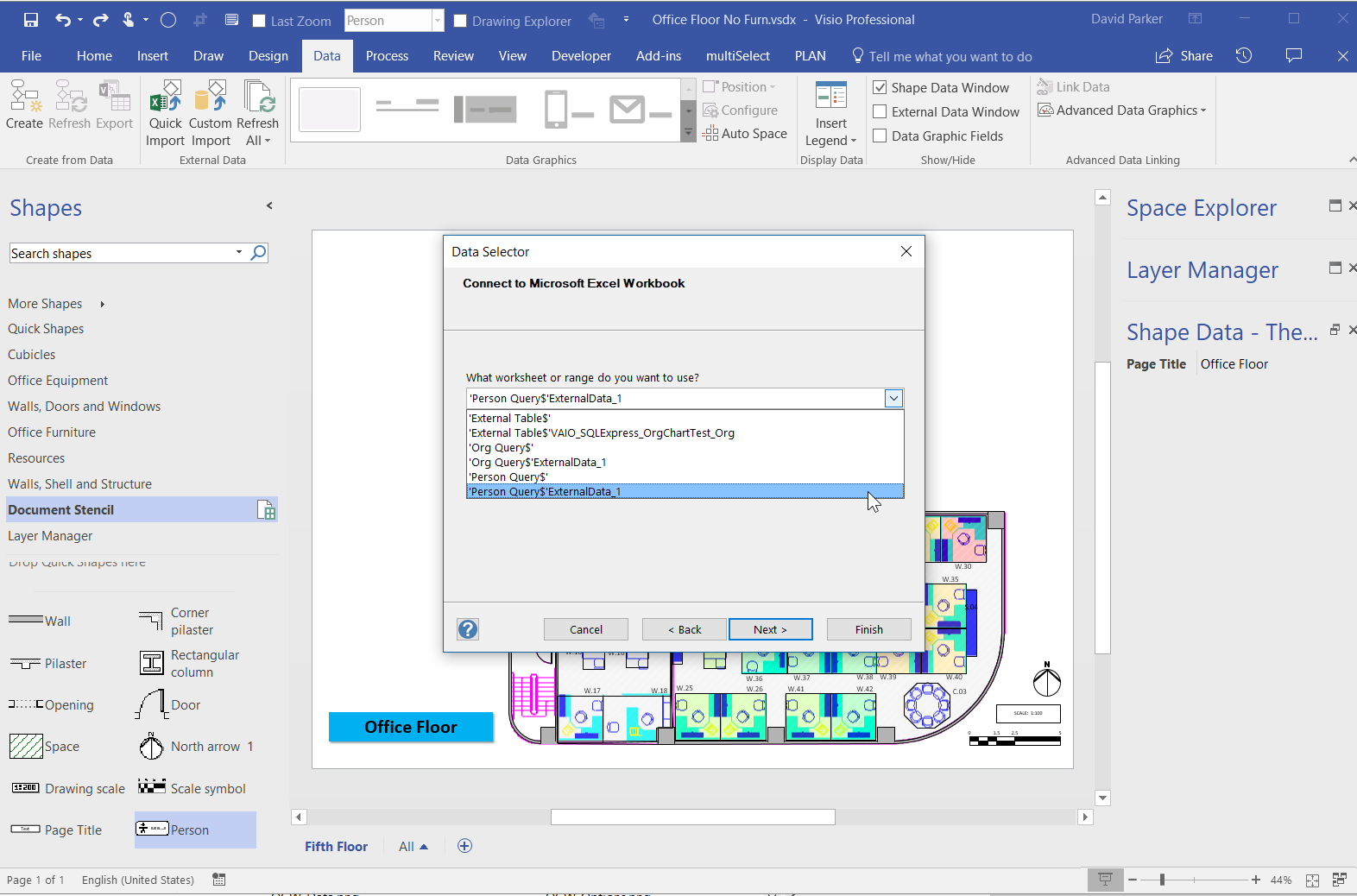
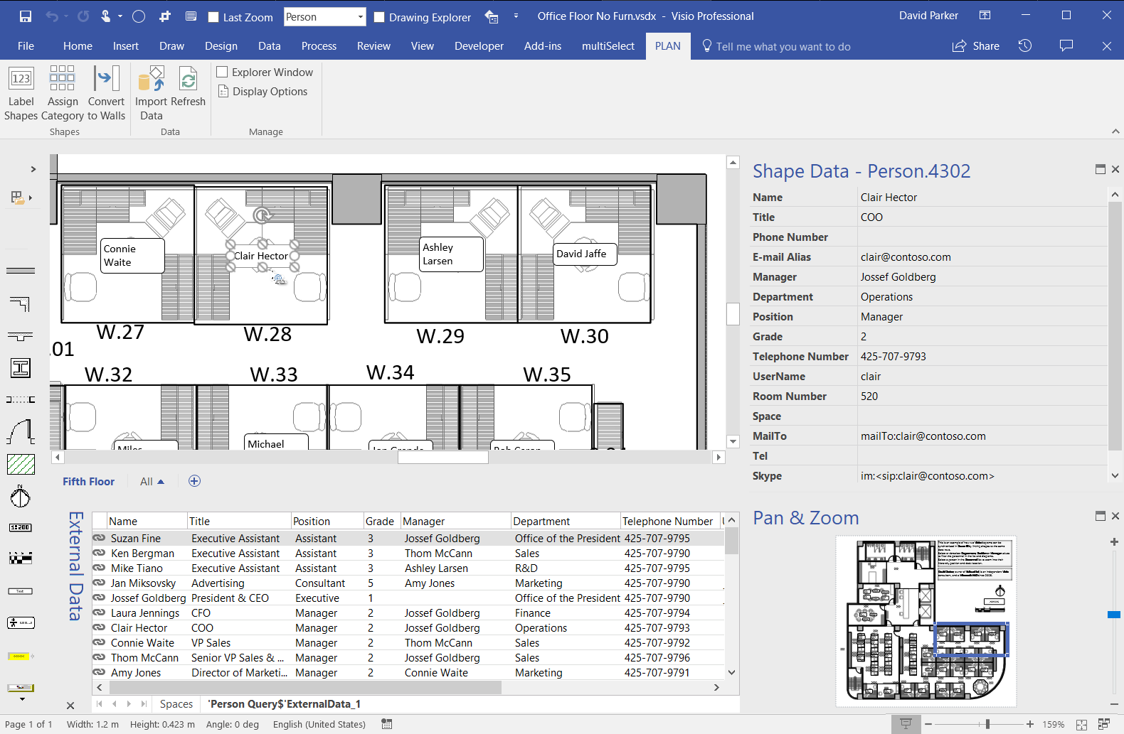
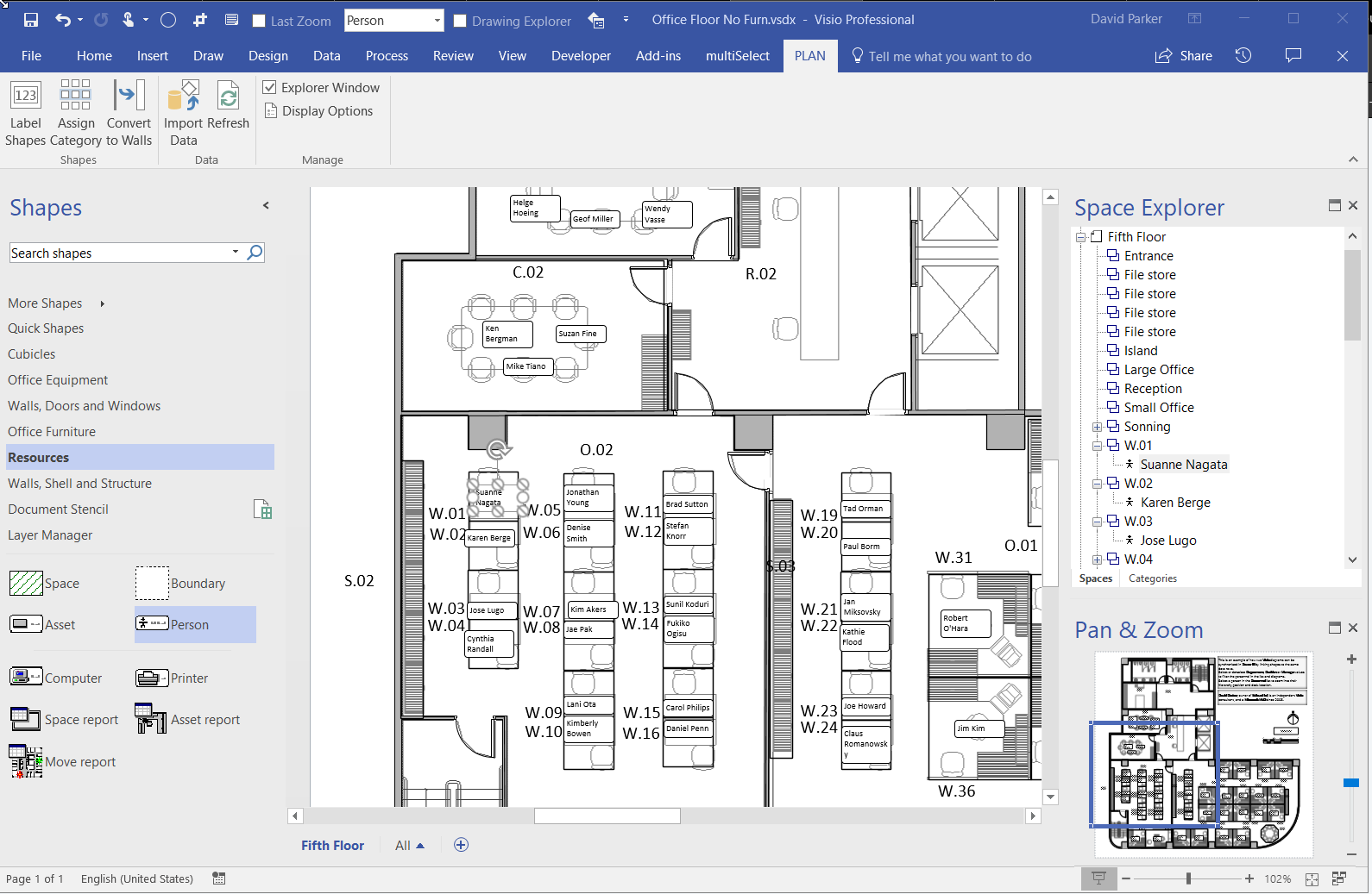
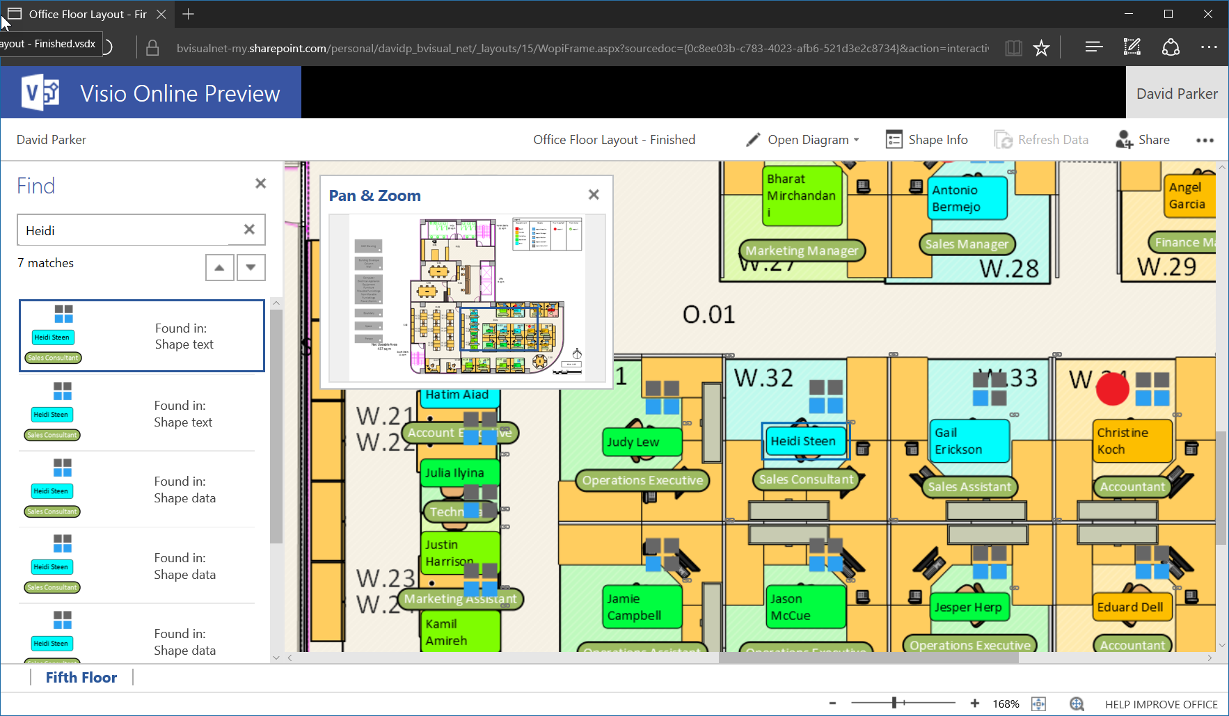
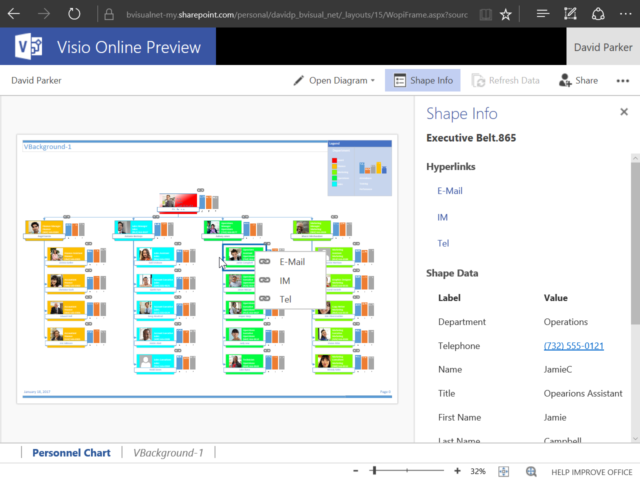
My last article, Aliasing Data Columns for #Visio Organization Chart Wizard , mentioned the slight anomalies in the default Shape Data rows for the Organization Chart shapes and the Resources / Person shape. This prompted me to create an alternative view of the same data that can be linked to the Person shapes on a floor plan, and then to use the preview Visio Custom Visual in Power BI to display both views of personnel synchronised by the same data. This demonstrates how easy it is to create an effective dashboard for locating personnel locations and their position within an organisational hierarchy at the same time!
Excel
Updating data sources from Visio using MSFlow … easily!
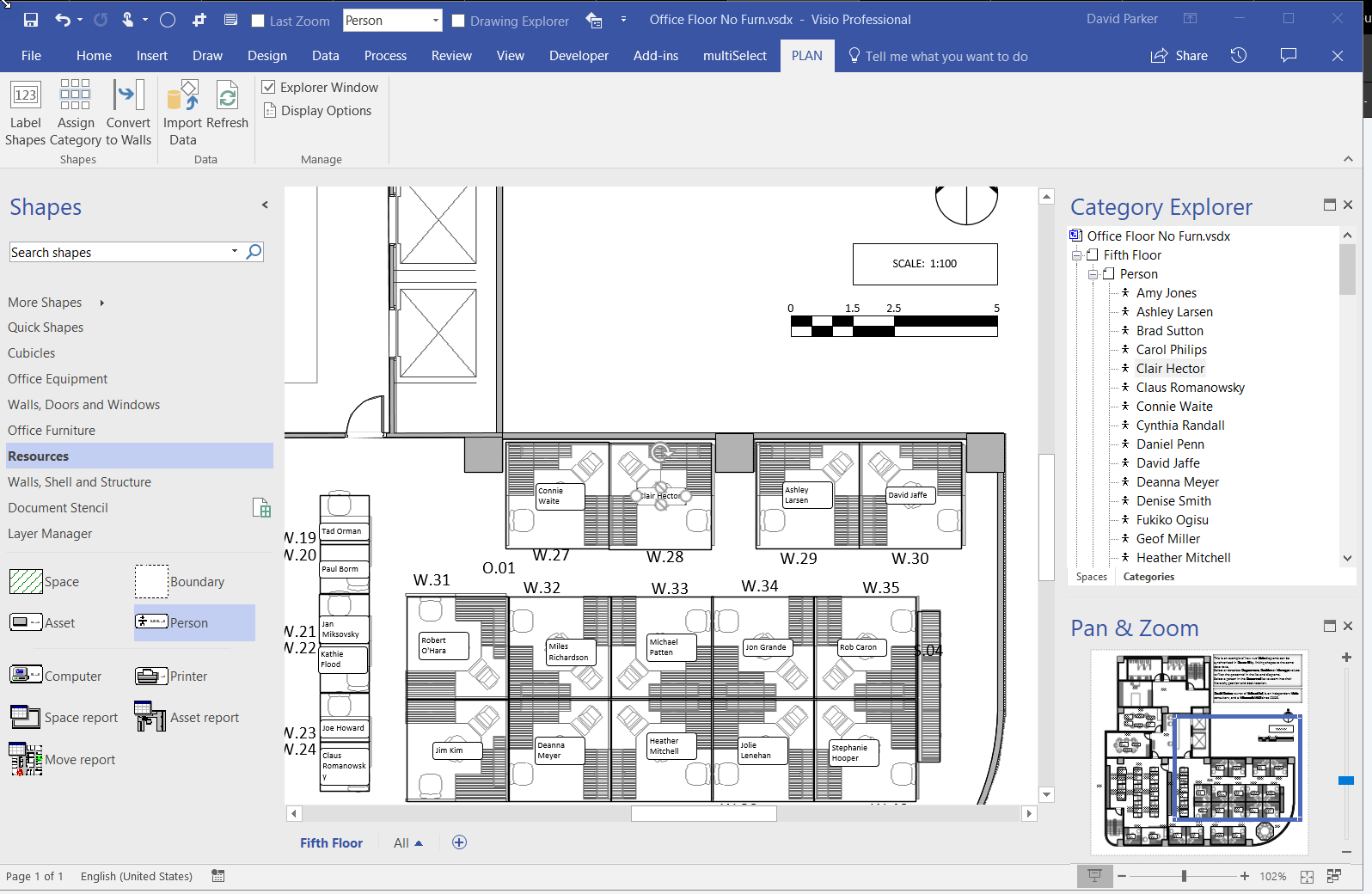
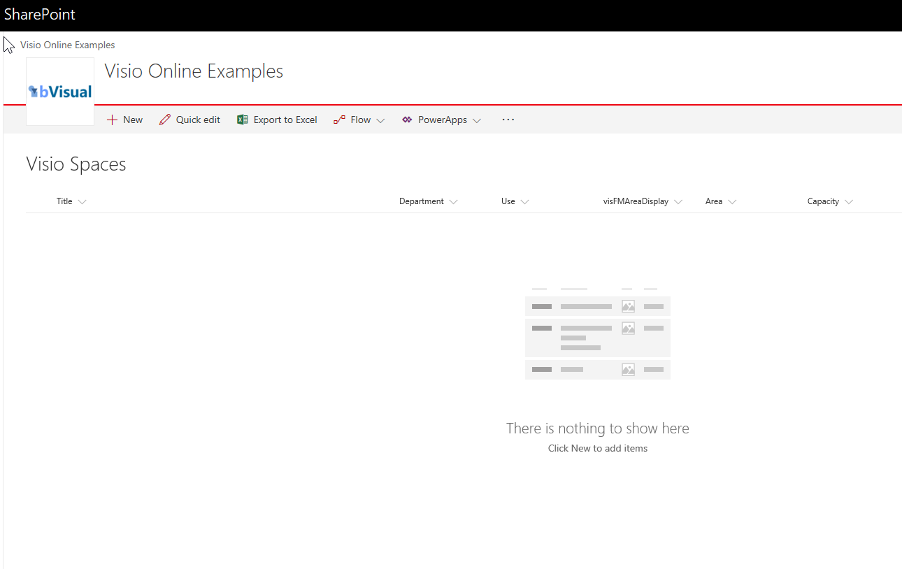
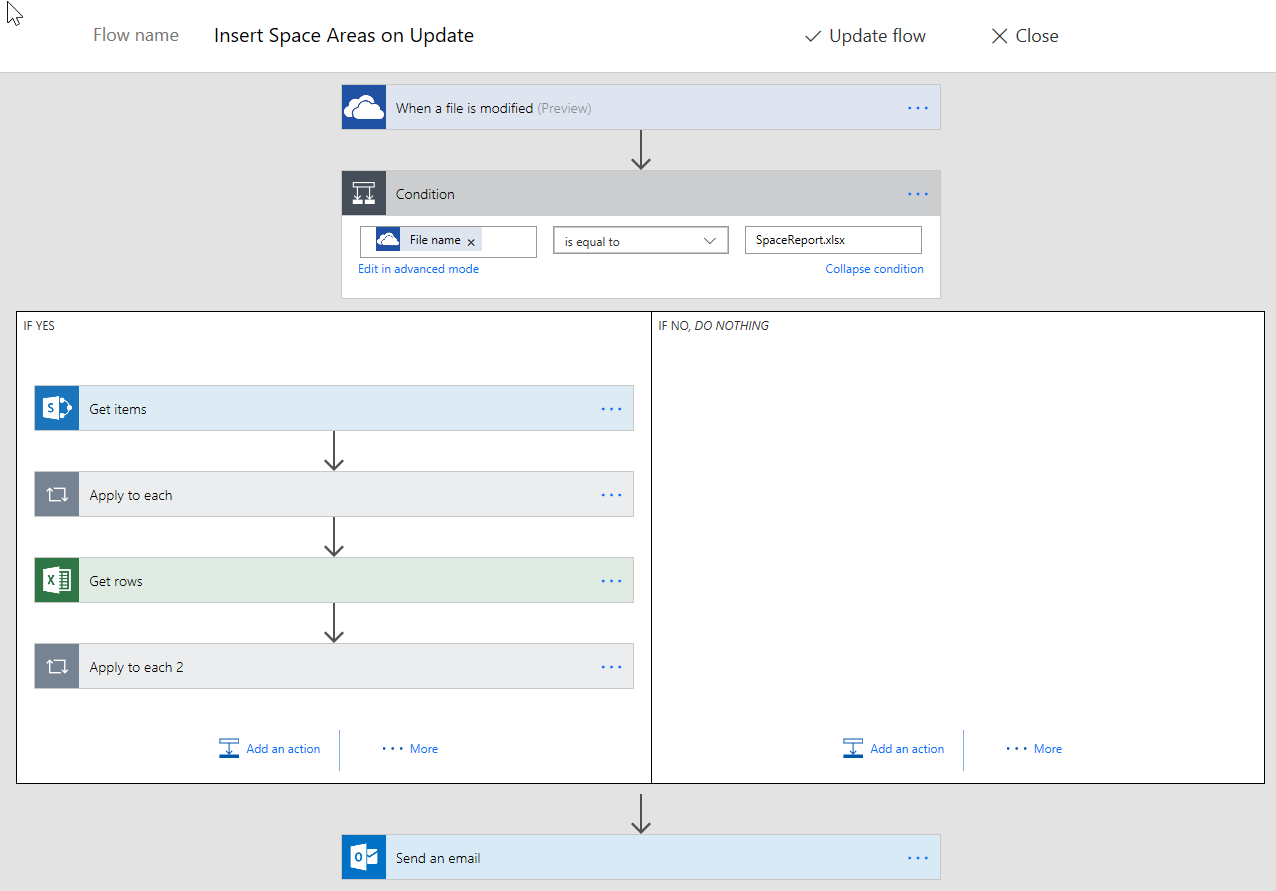
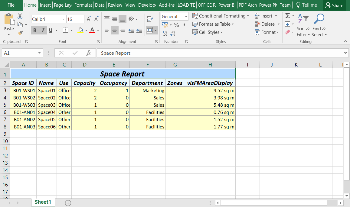
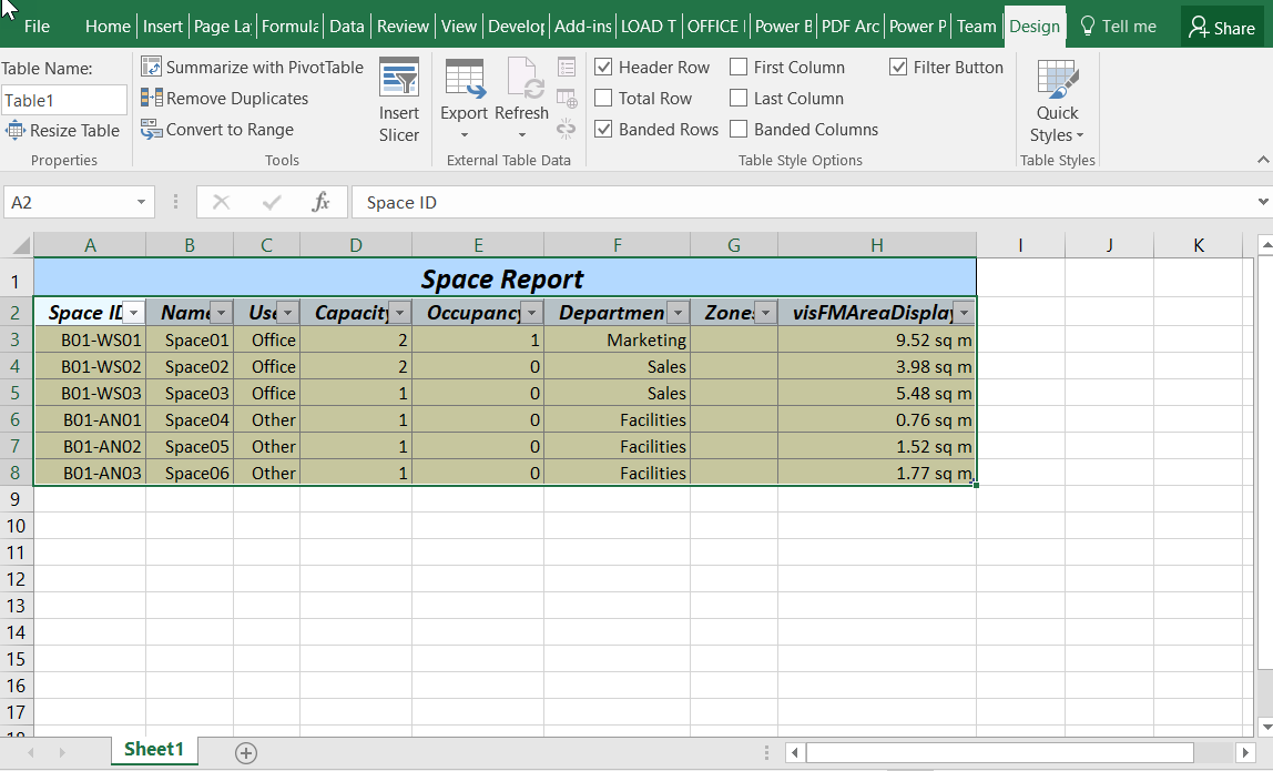
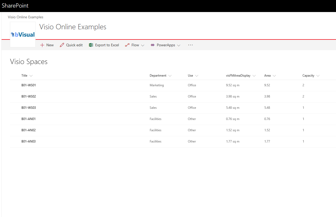
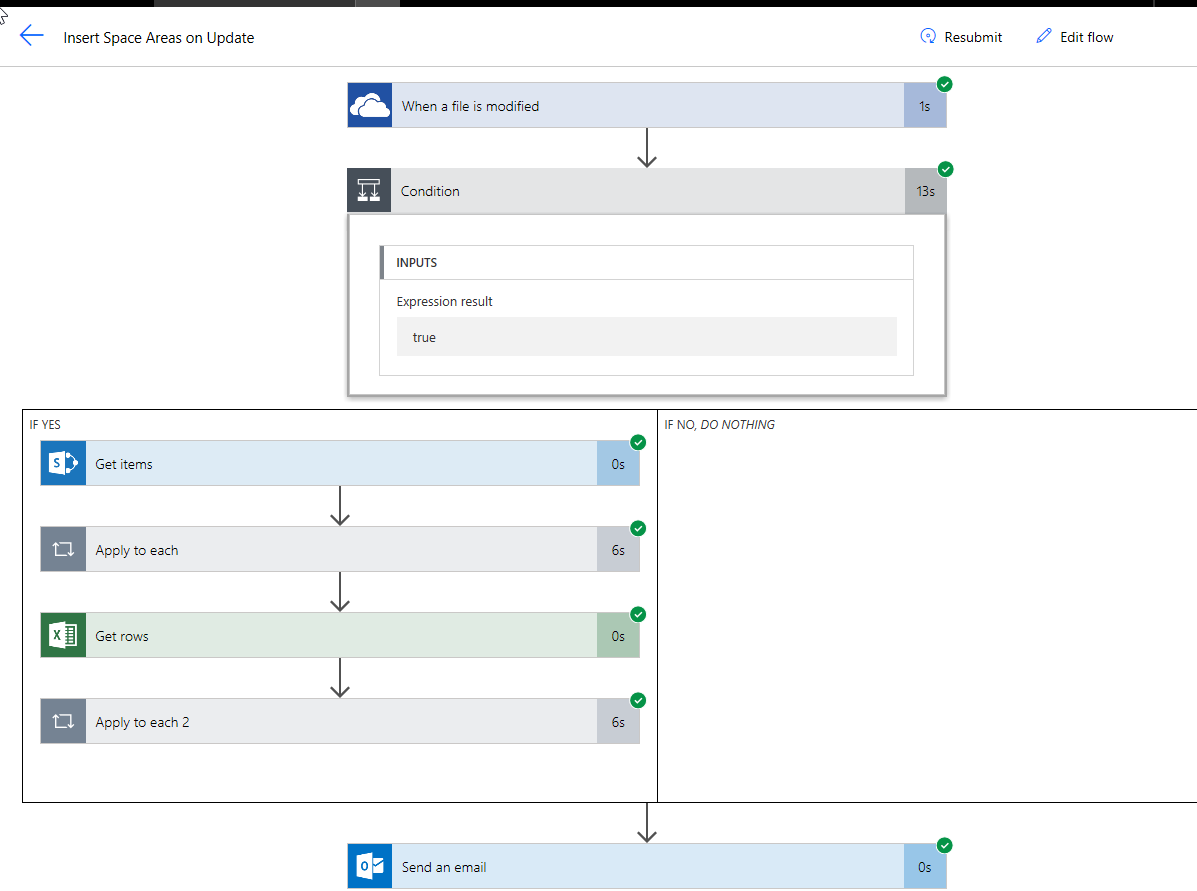
Most of my posts have been about using Visio as a data consumer by linking Visio shapes to data, but Visio can be the best place to create some data from. For example, an office layout can have personnel or equipment shapes within a workstation area, or space shapes are used to define areas which are used for calculating the space usage chargeback reports. There are non-facilities management related examples too, as the only consideration is what is the best way to create relationships, measure lengths, or calculate areas. These are all tasks that are best done by just moving, resizing, connecting or containing shapes interactively in the Visio interface. In this article I will explain how Microsoft Flow can be used update a data source simply from a Visio document.
[Read more…] about Updating data sources from Visio using MSFlow … easily!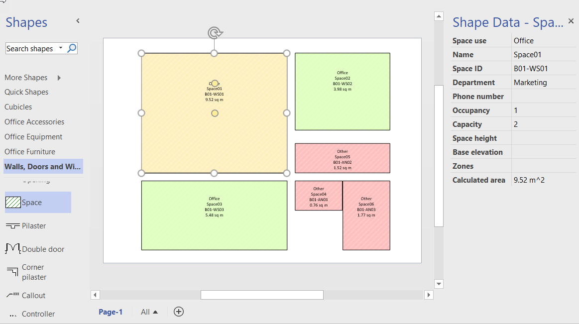
Previewing the Visio Custom Visual in PowerBI
It is time to talk about the new Visio custom visual for PowerBI. You may have read about it at Visio Power BI example and Add Visio visualizations to Power BI reports, but I wanted to add my findings. First, it is great to see this feature, but it is not yet the finished article. However, I hope I can show that it can be an extremely useful addition to the business intelligence toolset from Microsoft. I think that the existing Link Data to Shapes and Data Graphics features in Visio desktop are considered to be Operational Intelligence capabilities, whereas this new custom visual for PowerBI is definitely Business Intelligence. This is a different discipline, and I have been developing some guidelines for good practice when using Visio with PowerBI. In this article, I will demonstrate how I created a PowerBI dashboard using graphics and data from last years Microsoft Ignite conference.

Let me set the expectations because I am working with a preview of the Visio custom visual.
[Read more…] about Previewing the Visio Custom Visual in PowerBIData Visualizer for Visio Pro for Office 365 – Part 2
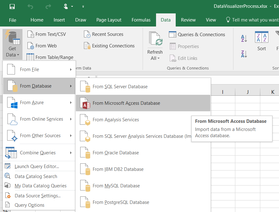
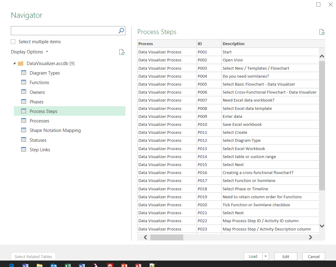
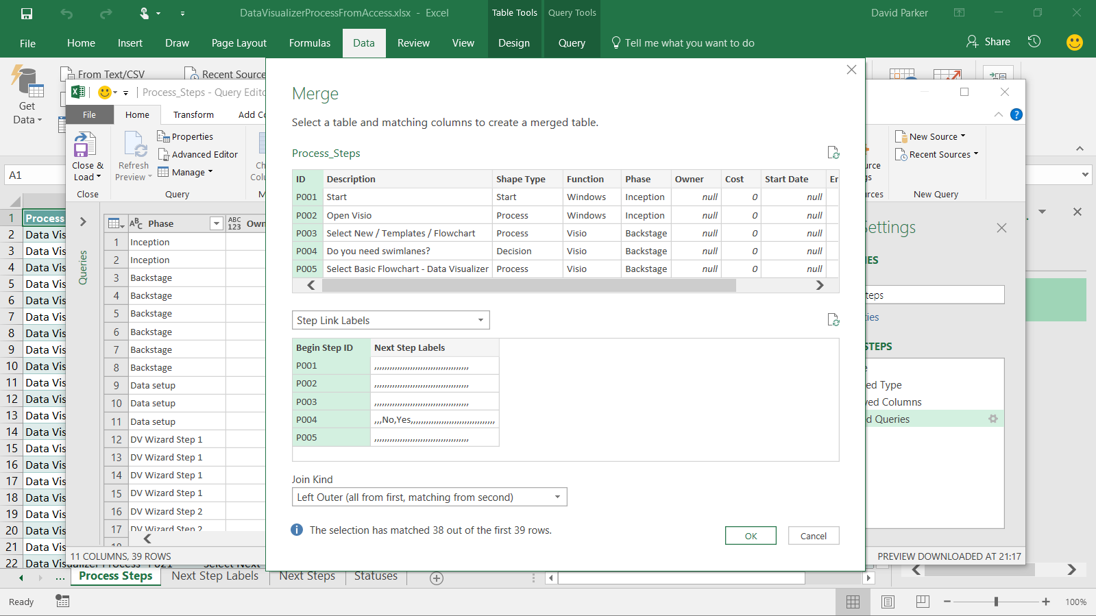
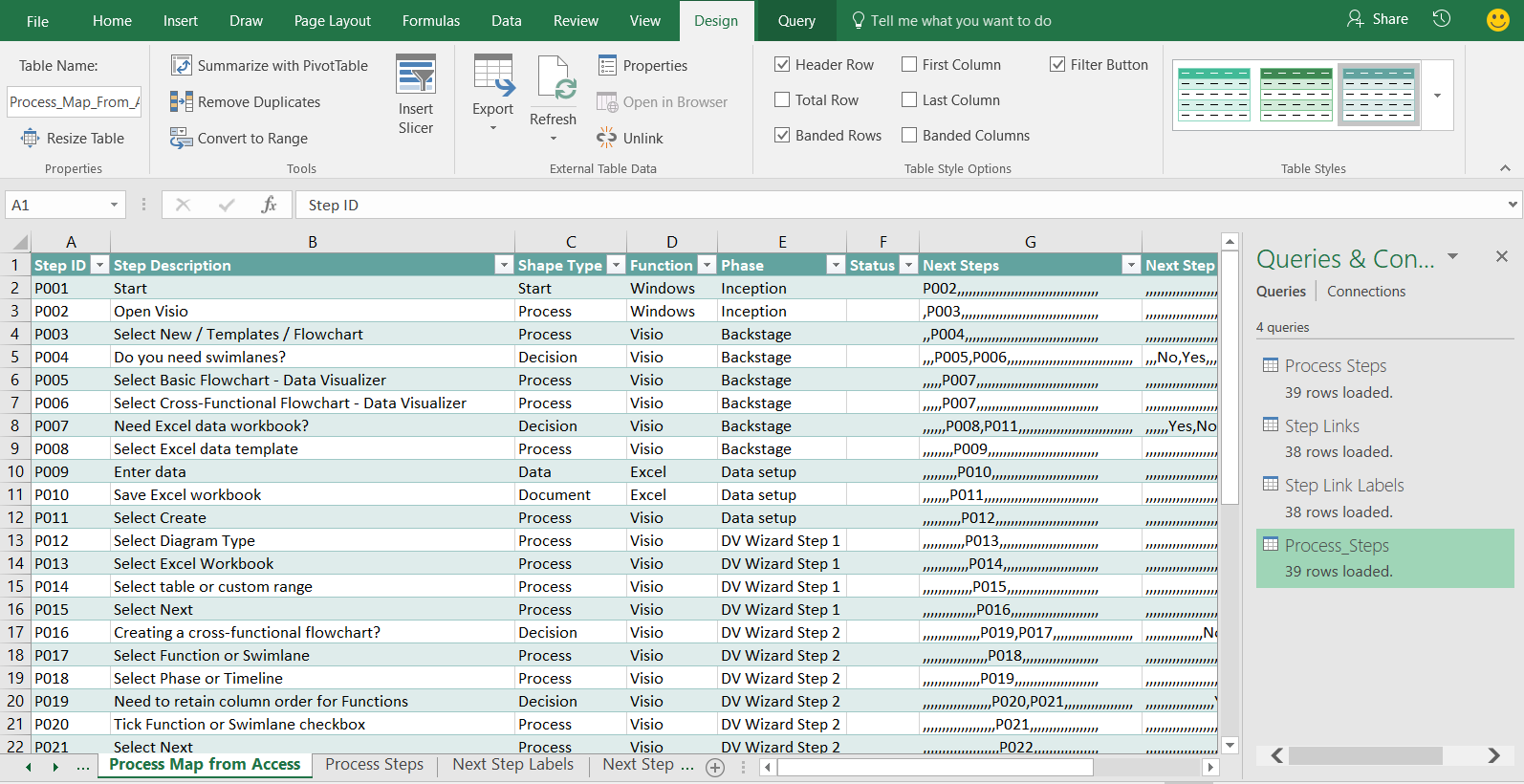
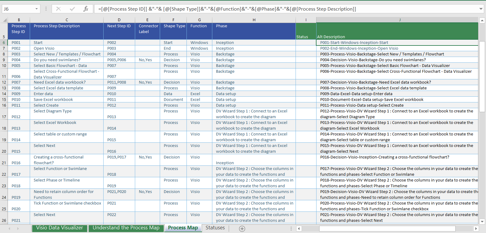
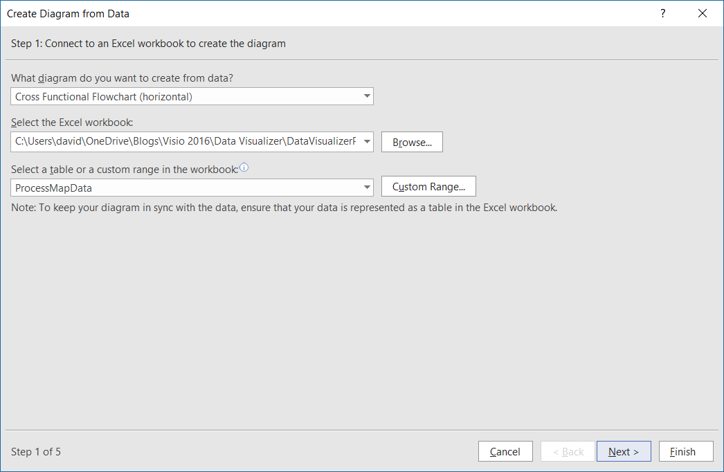
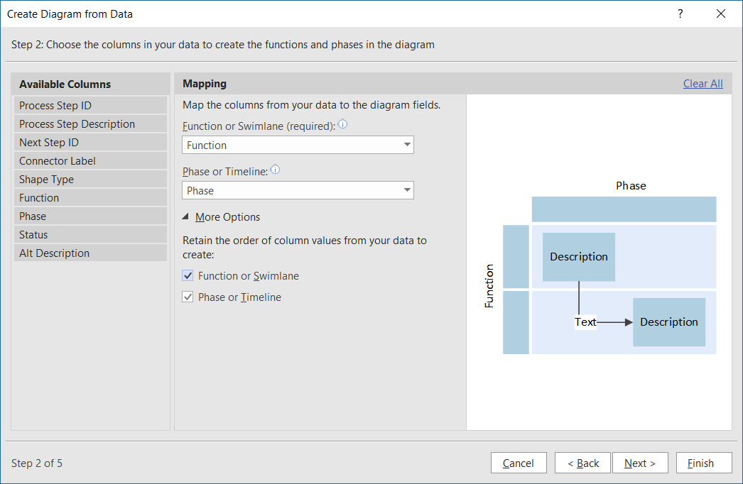
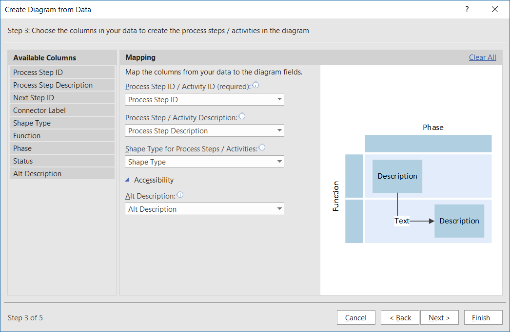
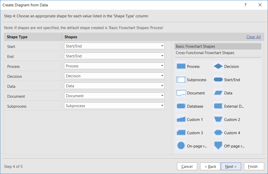
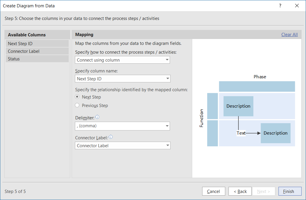
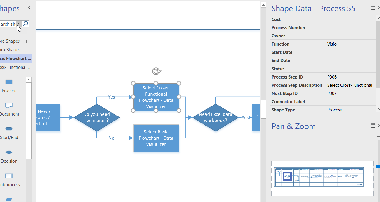
I walked though the steps to create a Cross-Functional flowchart automatically from an Excel table in my last article ( Data Visualizer for #Visio Pro for Office 365 – Part 1 ), but I often prefer to use a relational data source, such as Access or SQL Server, to store and organise my data. Therefore, I describe how Excel‘s Get Data (nee PowerQuery) can be used to merge together the data in a relational data source as a single table suitable for Data Visualizer in Visio Pro for Office 365.
[Read more…] about Data Visualizer for Visio Pro for Office 365 – Part 2
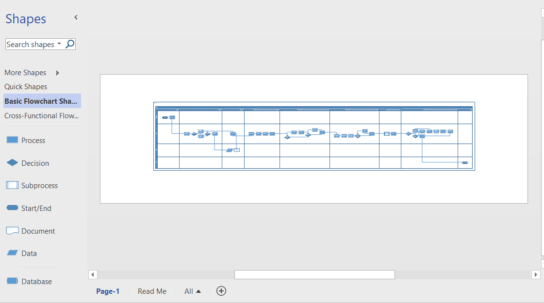
Data Visualizer for Visio Pro for Office 365 – Part 1
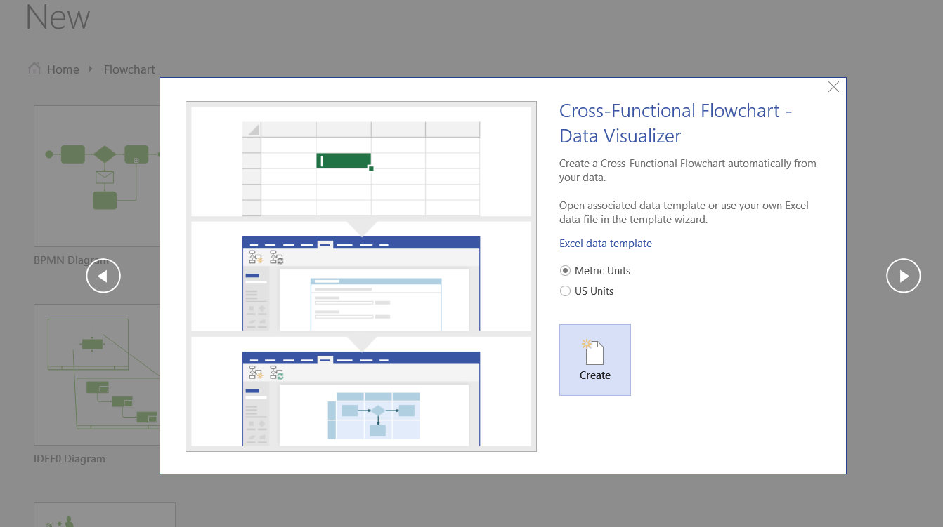
Microsoft have just released Data Visualizer for Viso Pro for Office 365! This great new feature provides you with the ability to create diagrams from an Excel table automatically. It currently comes with two new templates for creating Basic or Cross-Functional flowcharts, but the feature can be used for many other different types of diagrams.
[Read more…] about Data Visualizer for Visio Pro for Office 365 – Part 1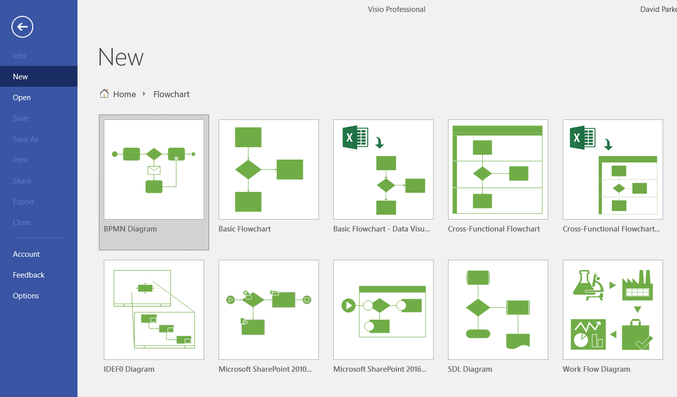
Managing People, Processes and Performance in PowerPoint? There is a better way!
I will be presenting a webcast on Thursday, March 23 | 12.00 to 13.00 (UTC) demonstrating how data-linked diagrams can provide a much more efficient and dynamic method for operational intelligence than PowerPoint.
Follow this link to register : http://bit.ly/2m2sPOv