• Skip to main content
  • Skip to primary sidebar
  • Skip to footer

bVisual

  • Home
  • Services
    • How Visio smartness can help your business
    • Visio visual in Power BI
    • Visio Consulting Services
    • Visio Bureau Services
    • Visio Training and Support Services
  • Products
    • Visio Shape Report Converter
    • SS Plus
    • LayerManager
    • visViewer
    • Metro Icons
    • Rules Tools for Visio
    • The Visio 2010 Sessions App
    • Multi-Language Text for Visio
    • Document Imager for Visio
    • multiSelect for Visio
    • pdSelect for Visio
  • Case Studies
    • Case studies overview
    • Using Visio in Education for GIS
    • Visualizing Construction Project Schedules
    • Visio Online Business Process Mapping
    • Nexans Visio Template
    • CNEE Projects, WorldCom
    • Chase Manhattan Bank
  • News
    • Recent news
    • News archive
  • Resources
    • Articles➡
      • ShapeSheet Functions A-Z
      • Comparing Visio for the Web and Desktop
      • Customising Visio Shapes for the Web App
      • Key differences between the Visio desktop and web apps
      • Using the Visio Data Visualizer in Excel
      • Using Visio in Teams
      • Creating Visio Tabs and Apps for Teams with SharePoint Framework (SPFx)
      • Designing Power Automate Flows with Microsoft Visio
      • Innovative uses of Visio Lists
    • Webcasts ➡
      • Visio in Organizations
      • My session and other Visio sessions at MSIgnite 2019
      • Power up your Visio diagrams
      • Vision up your Visio diagrams
      • The Visio 2010 MVP Sessions
    • Visio Web Learning Resources
    • Books➡
      • Visualize Complex Processes with Microsoft Visio
      • Mastering Data Visualization with Microsoft Visio
      • Microsoft Visio Business Process Diagramming and Validation
      • Visualizing Information with Microsoft Visio
  • Blog
    • Browse blog articles
    • Visio Power BI articles
    • Visio for Web articles
    • A history of messaging and encryption
  • About us
    • About bVisual
    • Testimonials
    • Bio of David Parker
    • Contact Us
    • Website Privacy Policy
    • Website terms and conditions
    • Ariba Network
You are here: Home / Visio / Adding clicks to infographics with Visio visual for PowerBI

Published on September 8, 2017 by David Parker

Adding clicks to infographics with Visio visual for PowerBI

Office 365 is a truly remarkable success story, but it is often difficult to understand what each of the parts actually do, or what it is actually in each edition. Microsoft are always adding applications and services to the various editions, or retiring ones that have been superseded. If I can’t see it, I can’t understand it, so I was very interested to see the Periodic Table of Office 365 infographic created by Matt Wade, a SharePoint guru who keeps an eye on these changes ( see http://icsh.pt/O365Table ). It really helps in comprehending the current Office 365 applications and their purpose. Indeed, I have seen his graphic go through many iterations over the last few months, and it will continue to change. However, it was not clickable, and I am a visual data guy, so I contacted him, and offered to integrate his infographic into a Power BI now that the Visio custom visual is available. I then found out that there are several different language versions of his infographic out there on the web, translated by other SharePoint professionals in his network.

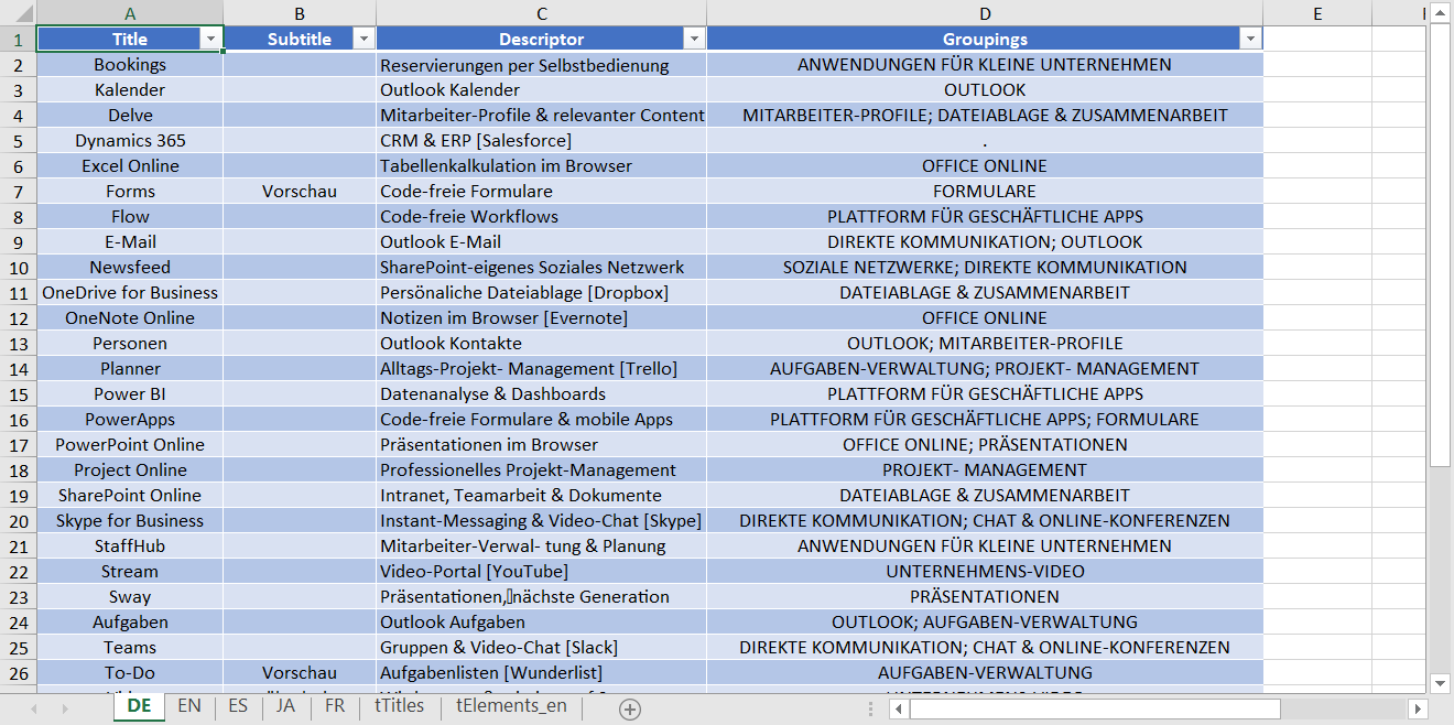
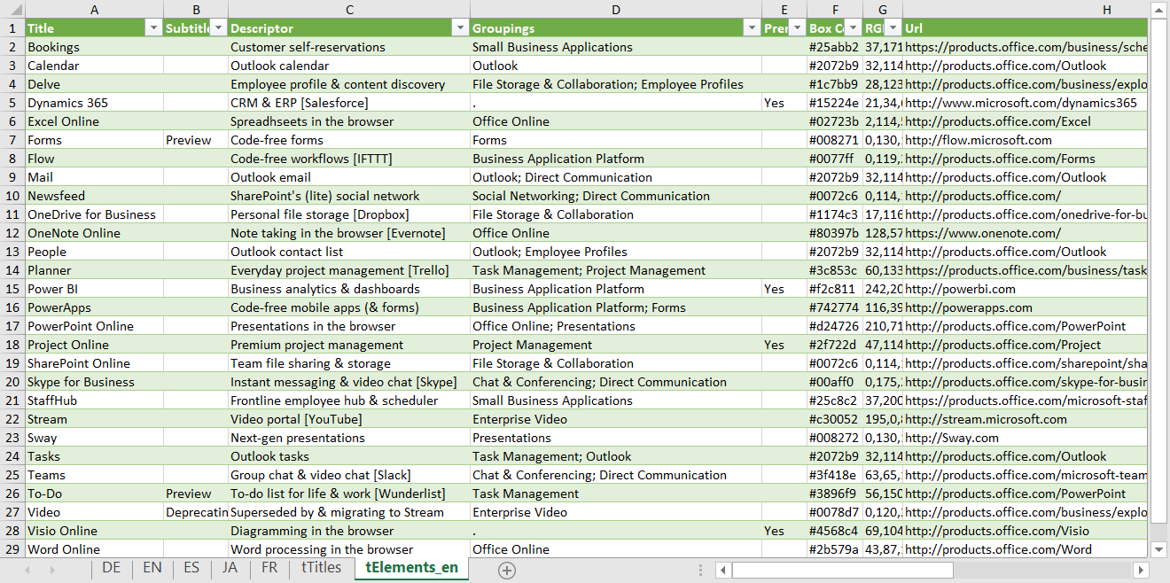
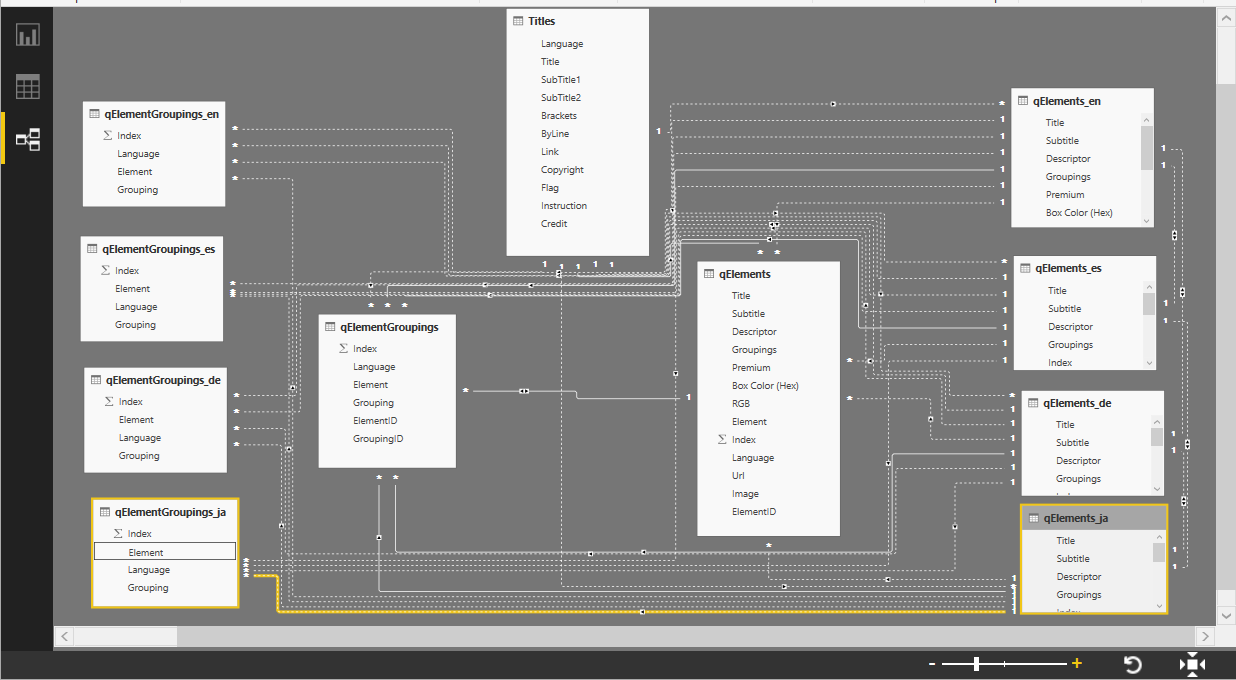
Matt agreed to let me have a go, so I created an Excel workbook of the group descriptions along with the translations of the application names, comments, etc. I created a worksheet for each language, but keeping English as the master one. I also created a table in Excel for the title information, and hyperlinks to the language versions and flag images.
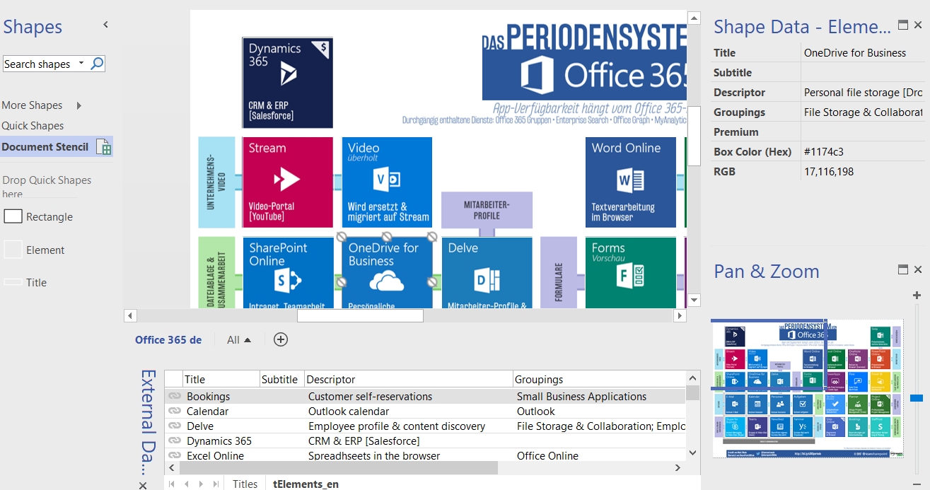
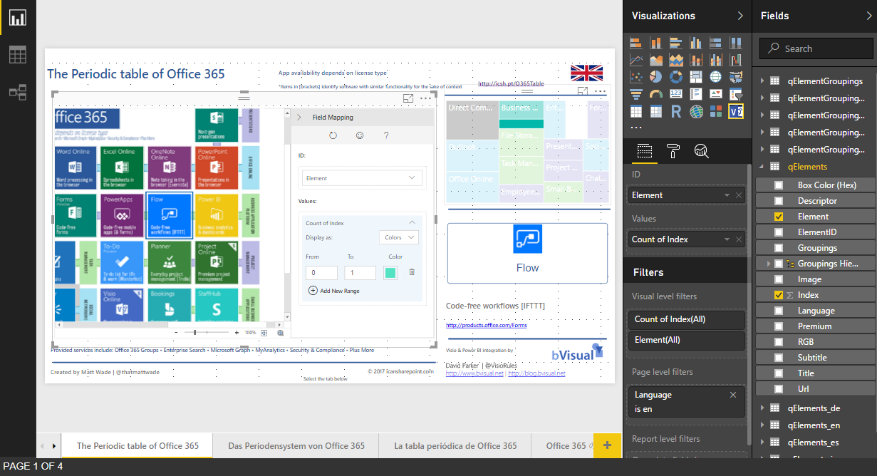
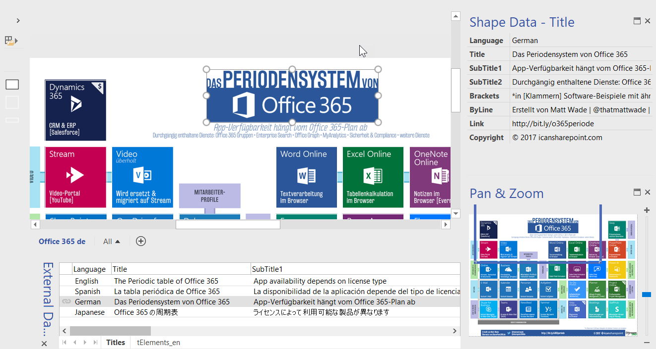
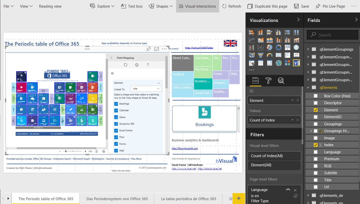
I inserted the English infographic into a Visio page, and created simple transparent rectangle master shapes for an Element and Title. All that was remaining was to link the English language table from Excel in Visio, and drag and drop each row as an instance of the Element over their respective image. It was a easy task to duplicate the page for each language, and replace the underlying image, and save as unique Visio documents.
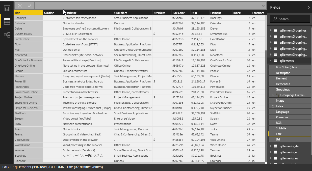
I then connected to the workbook in Power BI Desktop, and created queries to join the different language tables together, and created a relationship between language, elements and groupings. I could then use the new Visio custom visual to link the qElements query automatically to each rectangle because the Element column value equals the Title shape data value.


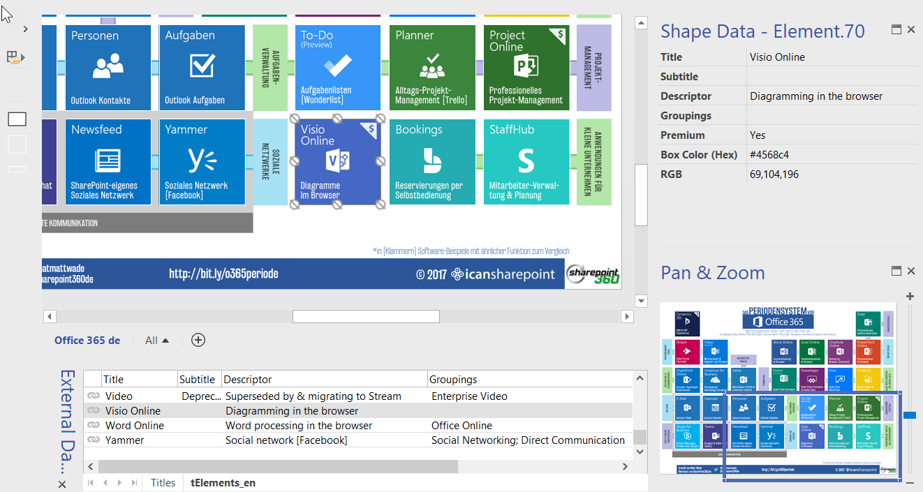
The Periodic Table of Office 365 infographic can now be panned and zoomed easily, and each of the elements can be clicked to display the grouping, information, and hyperlink automatically.
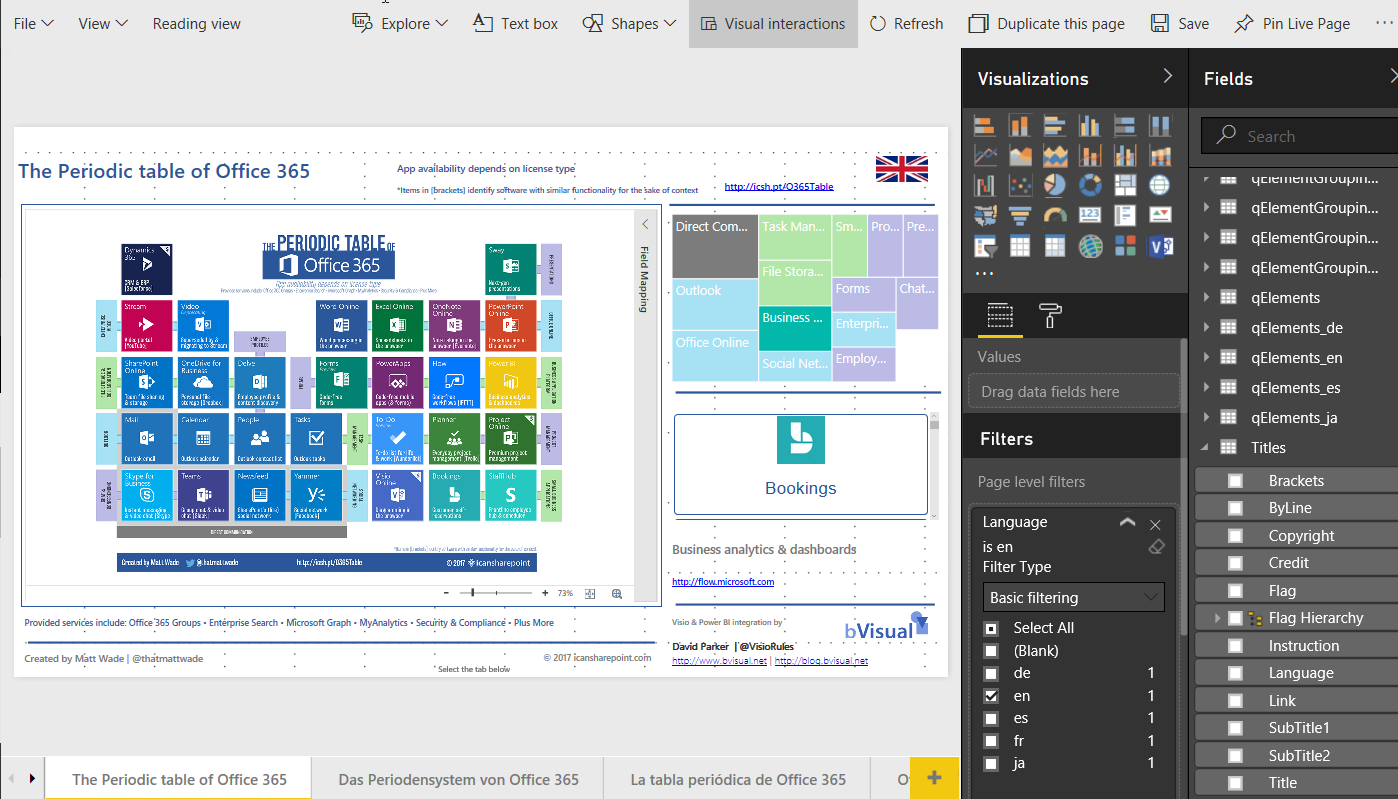
The initial English page in Power BI desktop could then be duplicated for each language, and all that needed to change was the page level filter, and the source Visio document.

MSIgnite_TalkingTech


I have been a Microsoft Most Valued Professional (Visio) for over 13 years, and producing Visio data solutions for more than 20 years, and am excited for the possibilities for self-service business intelligence dashboards utilising the Visio custom visual in Power BI. I will be showing off more #Visio / #Power BI / #PowerApps / #MSFlow integration at Microsoft Ignite ( #MSIgnite ) at the end of the month.

See The Periodic Table of Office 365 in Power BI Data Stories at https://community.powerbi.com/t5/Data-Stories-Gallery/Making-the-Periodic-Table-of-Office-365-responsive/m-p/248233
The Microsoft Visio team have produced some documentation about the Visio visual for Power BI at https://go.microsoft.com/fwlink/p/?linkid=851657.
Quick link : bit.ly/PTOffice365

Related

Filed Under: MSFlow, MSIgnite, Office 365, PowerBI, Visio, Visio Online Tagged With: MSIgnite, Office365, PowerApps

About David Parker

David Parker has 25 years' experience of providing data visualization solutions to companies around the globe. He is a Microsoft MVP and Visio expert.

Reader Interactions

Trackbacks

  1. #Visio in #PowerBI for viewing personnel hierarchies and locations | bVisual - for people interested in Microsoft Visio says:
    January 4, 2018 at 3:07 pm

    […] Adding clicks to infographics with #Visio visual for #PowerBI […]

    Log in to Reply

Leave a Reply Cancel reply

You must be logged in to post a comment.

Primary Sidebar

  • LinkedIn
  • Twitter

Recent Posts

  • Co-authoring and Commenting with Visio Documents
  • Fixing dimensions of 2D shapes
  • Merging Linked Data from Similar Tables
  • Smart Radio Buttons and Check Boxes in Visio
  • Using Button Face Ids in Visio

Categories

Tags

Accessibility Add-Ins Connectors Containers Data Export Data Graphics Data Import Data Visualizer Educational Excel GraphDatabase Hyperlinks Icon Sets JavaScript LayerManager Layers Legend Link Data to Shapes Lists MSIgnite MVP Office365 Org Chart PowerApps PowerBI PowerQuery Processes Setup and Deployment Shape Data Shape Design ShapeSheet ShapeSheet Functions SharePoint 2013 SQL Teams Validation VBA Video Visio Visio 2007 Visio for the Web Visio Online Visio Services Visio Viewer Webinar

Footer

bVisual Profile

The UK-based independent Visio consultancy with a worldwide reach. We have over 25 years experience of providing data visualization solutions to companies around the globe.

Learn more about bVisual

  • Amazon
  • E-mail
  • Facebook
  • LinkedIn
  • Twitter
  • YouTube

Search this website

Recent posts

  • Co-authoring and Commenting with Visio Documents
  • Fixing dimensions of 2D shapes
  • Merging Linked Data from Similar Tables
  • Smart Radio Buttons and Check Boxes in Visio
  • Using Button Face Ids in Visio

Copyright © 2025 · Executive Pro on Genesis Framework · WordPress · Log in