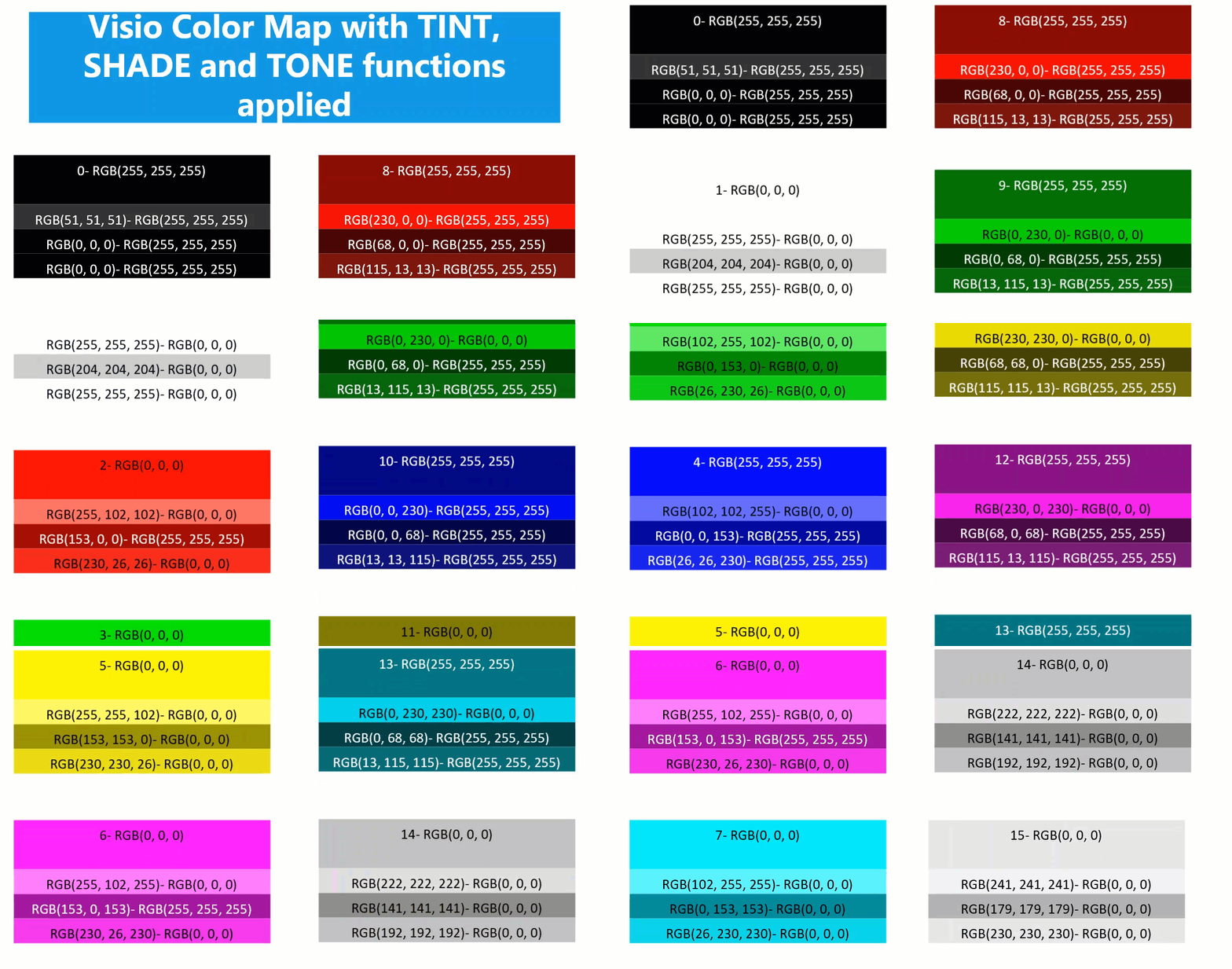
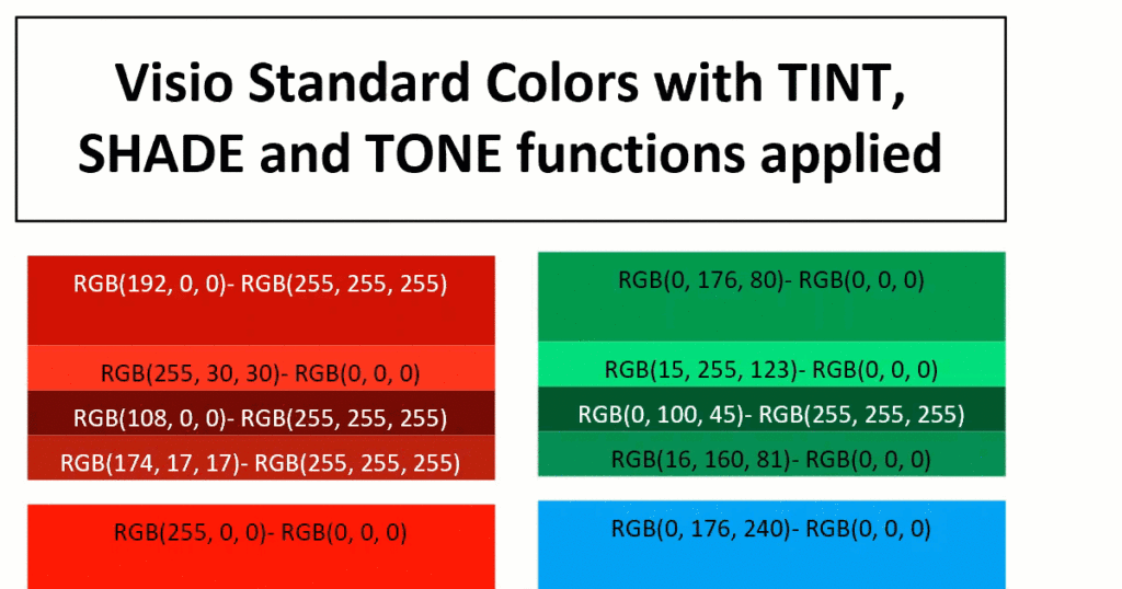
I am working on a project where I need to ensure high contrast of the text in the Visio shapes for accessibility. At first, I attempted to write my own formula but a colleague pointed my to a website that confirms if the contrast is acceptable ( contrast-ratio.com ), and showed me that a few of my examples failed. So the search was on for a better formula than my own. This lead me to a Stack Exchange answer with just what I was looking for (Formula for Color Contrast between Text and Background). All I needed to do was to convert this into a ShapeSheet formula or two, and then I could apply it to the text inside the shapes.

Any text created with Data Graphic Text Callouts cannot have the high contrast formula applied to because they can be moved independent of the background. However any text added with Insert / Field inside the shape changes between black and white with respect to the FillForegnd value in its background.
Following the article above, it is necessary to calculate the lightness, L, of the FillForegnd, and then to check if black or white text is going to provide satisfactory contrast.
- If L ≥ 0.175, then black text is okay.
- If L ≤ 0.1833, then white text is okay.
The relative luminance of a color is defined as L = 0.2126 * R + 0.7152 * G + 0.0722 * B where R, G and B are defined as:
- if RsRGB <= 0.03928 then R = RsRGB/12.92 else R = ((RsRGB+0.055)/1.055) ^ 2.4
- if GsRGB <= 0.03928 then G = GsRGB/12.92 else G = ((GsRGB+0.055)/1.055) ^ 2.4
- if BsRGB <= 0.03928 then B = BsRGB/12.92 else B = ((BsRGB+0.055)/1.055) ^ 2.4
Now this gave me something to work with, so I initially created multiple User-defined cells to hold the values of each variable.
The relative RGB values are simply as follows:
User.RsRGB=RED(FillForegnd)/255
User.GsRGB=GREEN(FillForegnd)/255
User.BsRGB=BLUE(FillForegnd)/255
Then the R, G and B values can be calculated using the following formulas:
User.R=IF(User.RsRGB<=0.0393,User.RsRGB/12.92,((User.RsRGB+0.055)/1.055)^2.4)
User.G=IF(User.GsRGB<=0.0393,User.GsRGB/12.92,((User.GsRGB+0.055)/1.055)^2.4)
User.B=IF(User.BsRGB<=0.0393,User.BsRGB/12.92,((User.BsRGB+0.055)/1.055)^2.4)
Then the Relative Luminance, which should return a value between 0 (black) and 1 (white), can be calculated as follows:
User.L=(0.2126*User.R+0.715*User.G+0.0722*User.B)
If black text is preferred then the following formula will provide the text colour:
User.FontColour=IF(User.L>=0.175,RGB(0,0,0),RGB(255,255,255))
However, if white text is preferred then use the following:
User.FontColour=IF(User.L<=0.1833,RGB(255,255,255),RGB(0,0,0))
This can all be compressed into a single formula:
User.fnHighContrast=IF(
(
0.2126*(IF((RED(ARG("Color"))/255)<=0.0393,
 (RED(ARG("Color"))/255)/12.92,
 ((RED(ARG("Color"))/255)+0.055)/1.055)^2.4)
+0.715*(IF((GREEN(ARG("Color"))/255)<=0.0393,
 (GREEN(ARG("Color"))/255)/12.92,
 ((GREEN(ARG("Color"))/255)+0.055)/1.055)^2.4)
+0.0722*(IF((BLUE(ARG("Color"))/255)<=0.0393,
 (BLUE(ARG("Color"))/255)/12.92,
 ((BLUE(ARG("Color"))/255)+0.055)/1.055)^2.4)
)
>=0.175,RGB(0,0,0),RGB(255,255,255))
This can then be called by other user cells by passing a colour into it:
User.FontColour=EVALCELL(User.fnHighContrast,"Color",FillForegnd)

The great advantage of this method means that the formula can be called multiple times from each of any sub-shapes, such as my example shapes in this article.
I recall VisGuy doing a post on this subject a few years ago (I just looked — it was eleven years ago!!). He found different formulas, which I’ve used several times over the years. Though I haven’t done so, it would be interesting to compare those results with yours.
Forgot to add the link: http://www.visguy.com/2008/10/31/make-your-text-stand-out/
Well, I tested Chris’ formula against mine, and there is 95+% agreement on the text colour. There is however times when Chris’ formula returns white rather than black text, which, surprisingly, raises an amber warning when tested on the web site I mentioned in my article. The black text that my formula produced always passed the contrast test on that web site, even though, to my eyes, I sometimes thought the white was clearer. Since my shapes need to pass the contrast test, I will have to stick to my formula.
One example of my surprise was text on red background. White text only scores 3.99, but black text scores 5.25.
Interesting. I was quite sure you would have looked at Chris’ formula 🙂 and it’s interesting to note that the results of the two are so close. I also understand about needing to meet compliance regulations so it’s good that you found the formulas that you did! Thanks for making this easy for those of us who might stumble across this requirement in the future.