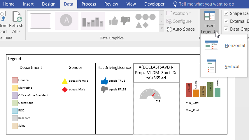
Data Graphics in Visio Professional (and Premium) are a great way of surfacing the information in each shape, but it can be easy to forget what the Color By Value, Icon Sets or Data-bars represent:
Fortunately, Visio provides an Insert Legend task, which will lay each of the Graphic Items out into a list, either horizontally or vertically, in the top right corner of the page:
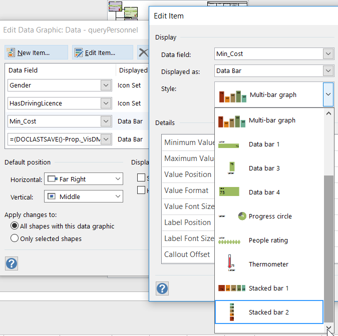
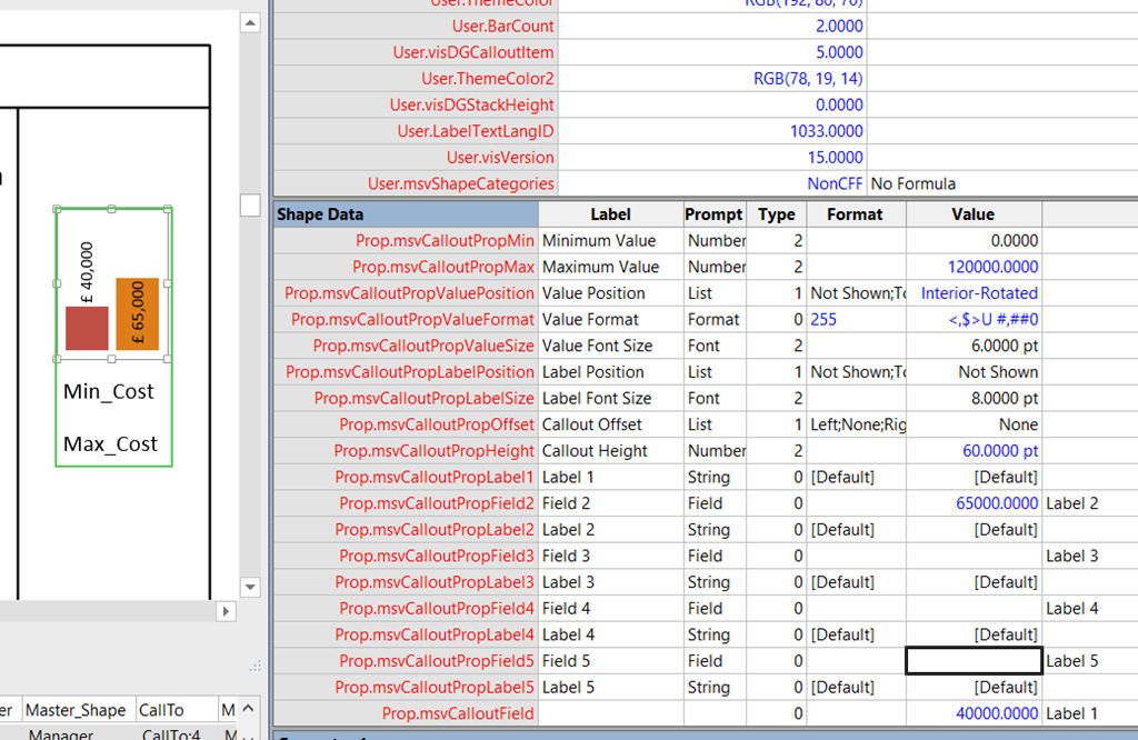
Whilst the text can be easily edited to be something more meaningful, it is annoying that the Multi-bar graph Data-bar always shows 5 columns, even if you have used less in your Data Graphics. In my case, I was only using the first two in order to compare Min_Cost with Max_Cost. The editing of this legend item is a bit more obscure, and requires opening the ShapeSheet of it.
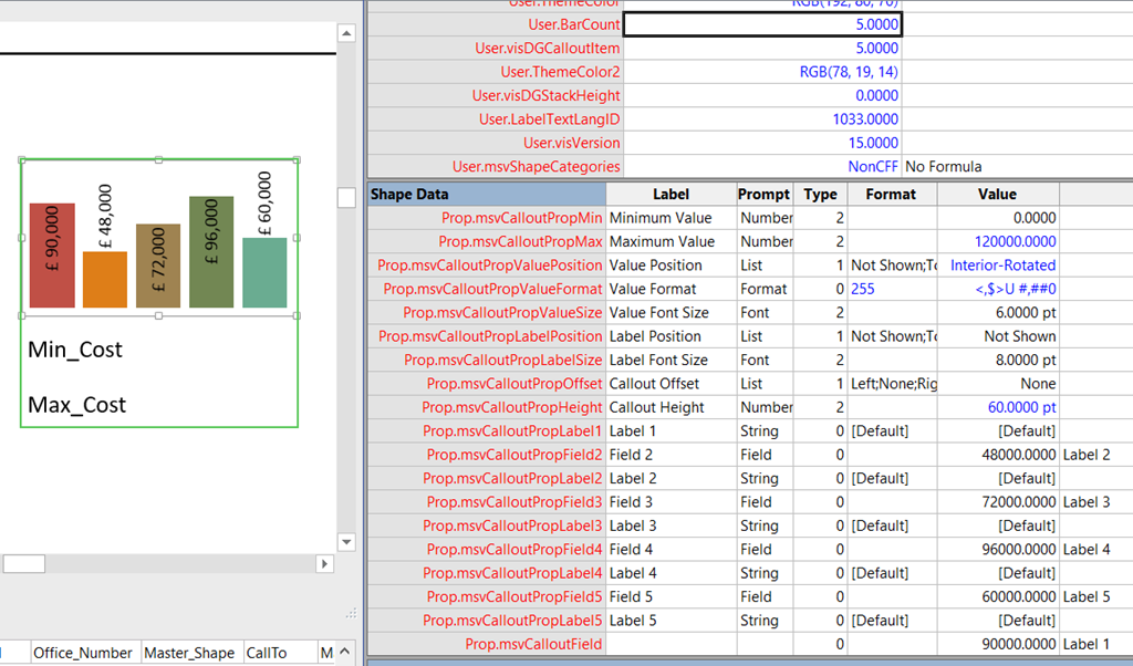
In there, I found a User.BarCount cell, which is set to 5. I changed that to 2, and immediately the legend shape reduced in width, but the bars and text for the remaining 3 unrequired bars still showed.
Then I edited the Value in the Shape Data rows with the labels Field 3, Field 4 and Field 5 by entering two double-quotes, “”, and then these bars and their text disappeared. This legend item now only shows 2 bars, and is the correct width, and I could get on making the rest of the legend look good. I also entered more suitable values in Prop.msvCalloutField.Value and Prop.msvCalloutField2.Value (Field 2) cells whilst I was at it.
This technique probably applies to the Stacked bar 1 and Stacked bar 2 Graphic Items too: