

The Microsoft Visio product team have released a great video introduction to the Visio Data Visualizer, but even that does not reveal all of its power. So, here are some tips about using the Microsoft Visio Data Visualizer add-in in Excel. Firstly, the add-in currently offers three different types of diagram, and each have a number of alternative layout arrangements.
- Basic Flowchart – 4 layouts
- Cross-Functional Flowchart – 5 layouts
- Organization Chart – 5 layouts
Although these are the proposed diagram types, there is no reason why other types of data, such as network devices, cannot be used with any of them.

Re-use existing tables
Each of the diagram types utilize specific column headings and are targeted at a particular named table (ListObject). So, knowing this, it is possible to use any table in the workbook, which has the specified name, and includes the mandatory columns. Of course, the sample table will need to be deleted before the alternative table is named, since those names need to be unique.
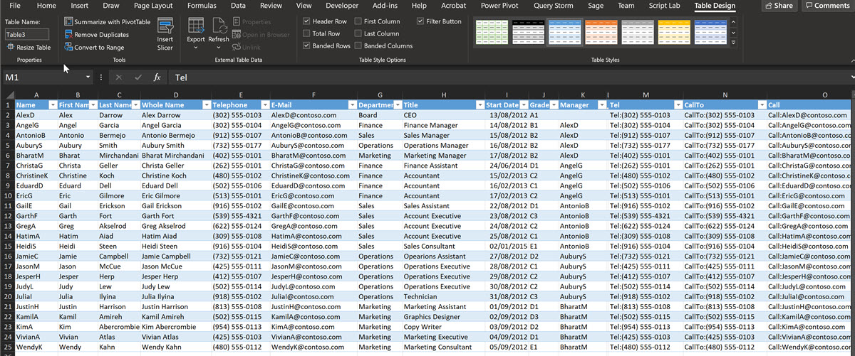
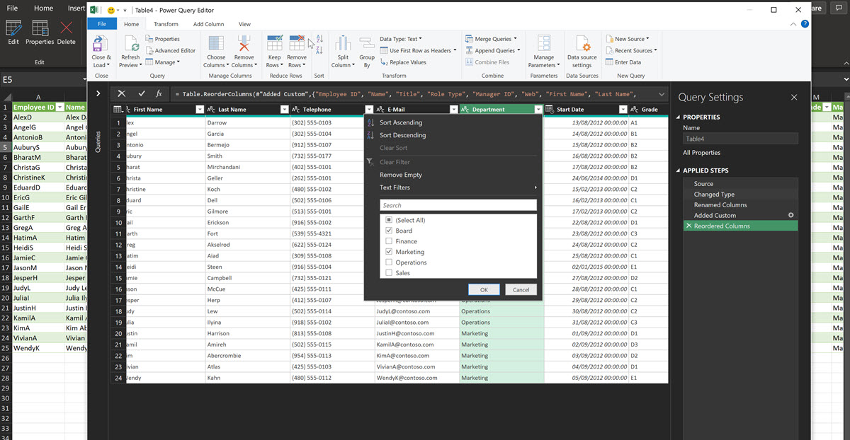
Similarly, existing columns which contain the desired data can be re-named to match the mandatory ones, or a query can be created from the original table to create a new table with the specified name and mandatory column names. Power Query / Get & Transform Data is absolutely brilliant for this!
Organization Charts
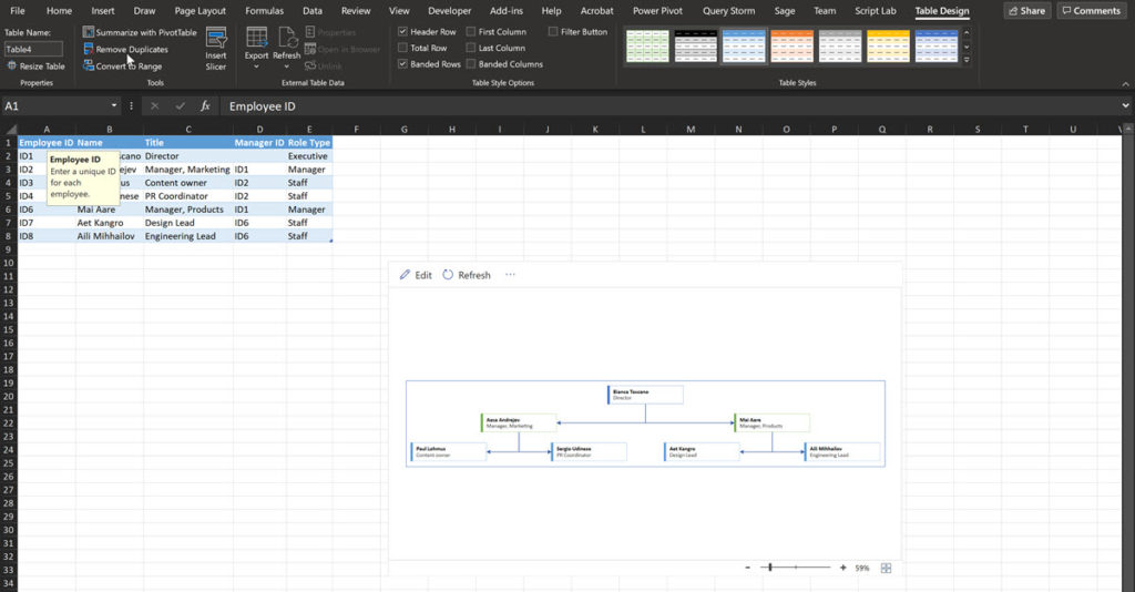
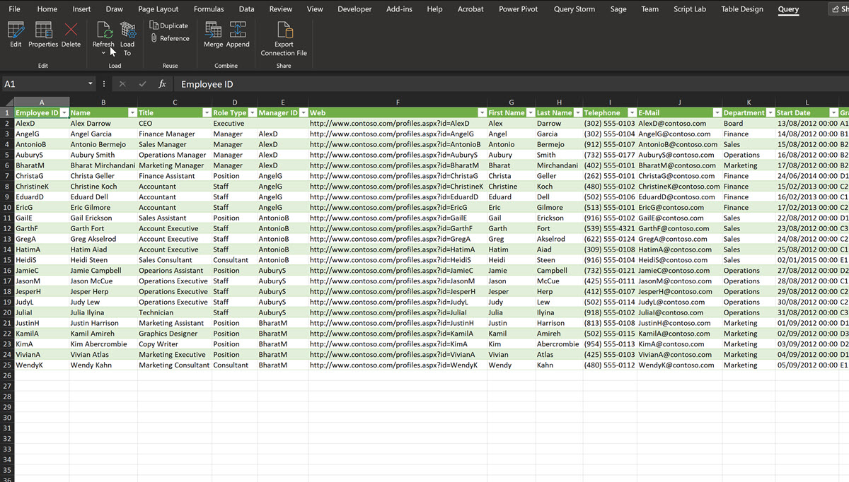
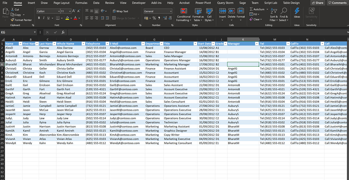
For example, the Organization Chart diagram type requires the following minimum column names:
- Employee ID – The row unique identifier
- Name – The top bold label
- Title – The lower label
- Manager ID – The reports to value(s) in the Employee ID column
- Role Type – The colour coding of the shapes
Flowchart diagrams
The Basic Flowchart diagram type has five mandatory column headings, and one optional, although more are allowed.
- Process Step ID – The unique row identifier
- Process Step Description – The label text
- Next Step ID – The comma-separated list of
- Connector Label – The comma-separated list of labels for the connectors
- Shape Type – The shape type to use
- Alt Text – Optional for accessibility narration
The valid Shape Types set in the Data-Validation list :
Process, Decision, Subprocess, Start, End, Document, Data, Database, External Data, On-page reference, Off-page reference, Custom 1, Custom 2, Custom 3, Custom 4
The Subprocess shape will be used if the value is not found in the above list
The Cross-Functional Flowchart diagram type has two extra mandatory columns:
- Function – The label of the horizontal swimlane
- Phase – The label for any vertical stages
Org Chart Example
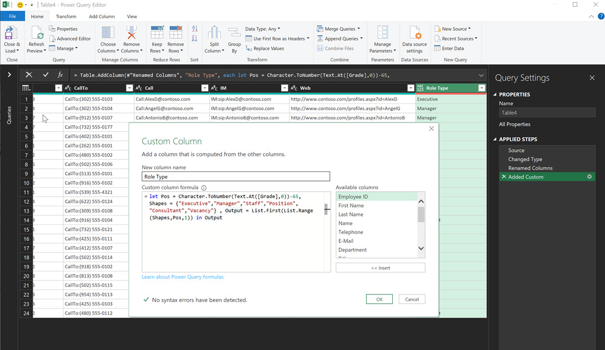
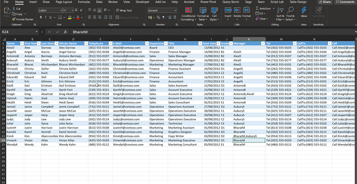
One example is where I crated a new table, using Power Query, from an existing one, and re-named three columns, and added another using a formula.
Name => renamed as Employee ID
Whole Name => re-named as Name
Manager => re-named as Manager ID
Grade => new Role Type column created with a formula


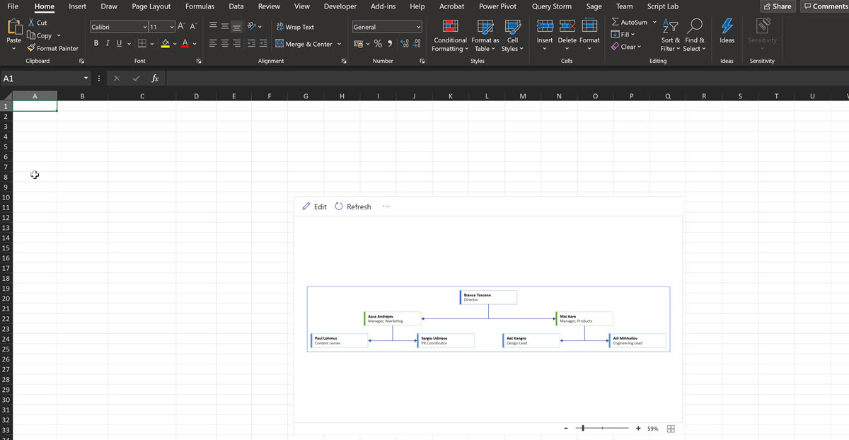


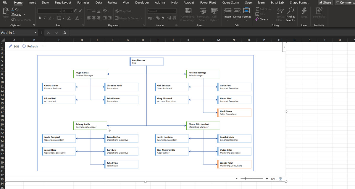
The sample data table can be deleted, but take a note of its name first. Then, either rename an existing table with that name, or, as above, create a new table with that name using Power Query. If the table name matches, and the required column headings are present with suitable data, then the Visio diagram can be refreshed and .. hey presto! the chart is updated with your data.
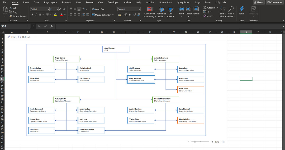
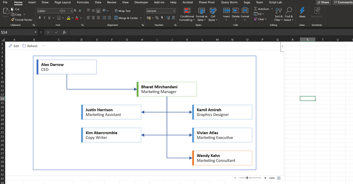
Moreover, now that the data is in a different worksheet, the Visio diagram can be enlarged and moved to the top left corner. This looks much better for presentations.
One word of warning … if you use an intermediate Power Query table, as I do, then you must refresh that query if you edit the data in the source table.
Matrix reporting in Org Charts
The Organization Chart sample data provided with the add-in only shows only single values in the Manager ID column. However, just like the Next Step ID column in the flowchart diagram types, this is a comma-separated list of valid Employee ID values. The Person shapes will be suitably connected together, although you need to choose a suitable layout arrangement for it to be clearly understandable.


Multiple organization hierarchies
If your data contains more than one row that does not have a Manager ID value, then the diagram is split into groups.

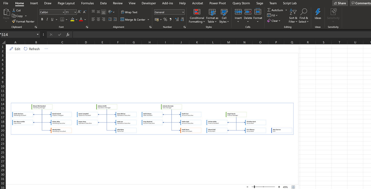

This may be desirable in certain scenarios…
Diagrams from filtered rows
However, one of the virtues of having an intermediate Power Query is that the data can be filtered. This means that you can create an chart from a subset of the data, such as this example for the Marketing Department.


Use any data source with Power Query
Power Query in Excel (displayed as Get & Transform ) provides the ability to get your data from a myriad of data sources, so using the technique above to transform the data into a suitable form for Visio Data Visualizer really opens up these data driven diagrams for everyone.
That’s enough for today, but I hope you have seen enough to try the Microsoft Visio Data Visualizer … it is free to qualifying Excel license holders!