

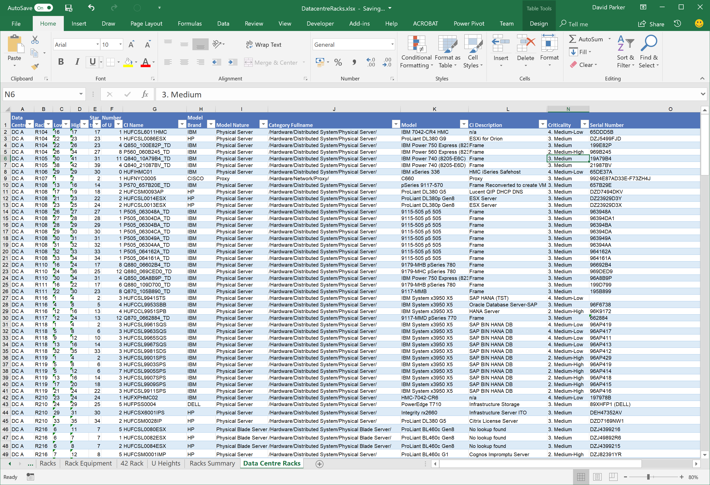
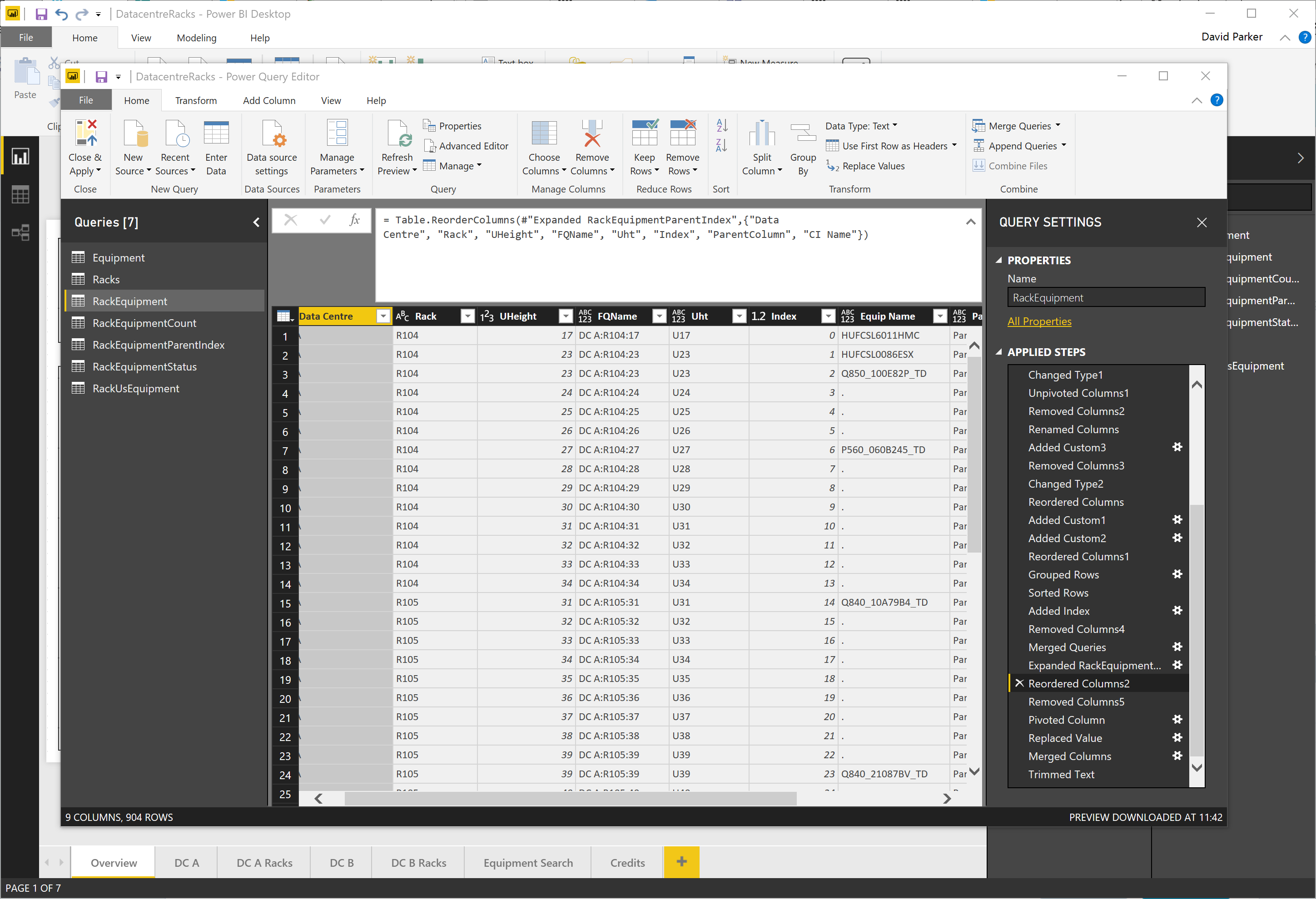
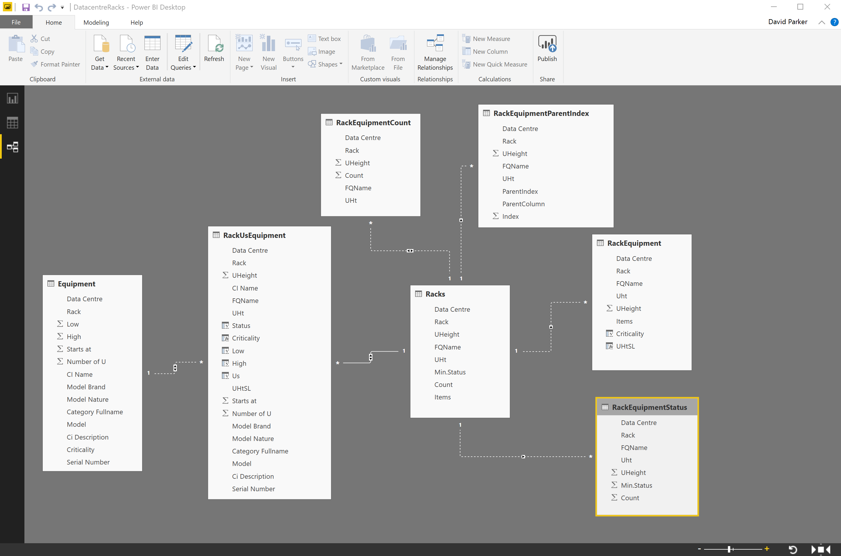
I have often diagrammed rack and cabinet layouts and elevations using Visio linked to a database or Excel tables. There is a Rack Diagram template in Visio which is great for manually creating cabinet elevations manually, but there is nothing currently out of the box to automate this process, so it can be a laborious task unless you have some custom code. It is quite simple to draw a computer room layout of the racks and cabinets and to link each one to a row of data. In this article, I have a table of rack equipment in Excel, and used PowerQuery in PowerBI to summarize these rows for each data center, rack and U height position, since there are sometimes more than one item of equipment per U height. In this example, I have color coded the criticality of each equipment such that the most important display as red, and the least important as green. This means that a PowerBI user can quickly see where the critical racks, U heights and equipment are. Of course, I could have used any metric, such as power consumption, heat output or humidity, for the colour-coding. It all depends on the data available, and the audience for the report.


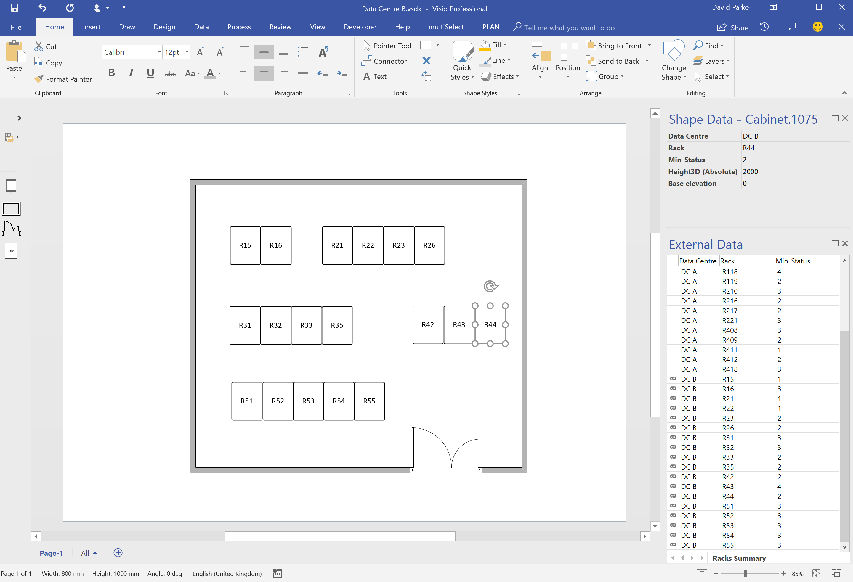


I used the Visio custom visual for the data centre floor plans because it is so simple to map PowerBi data rows to the Visio shape text or selected Shape Data values. However, I experimented representing the rack elevations in two different ways, so that I could test the difference.
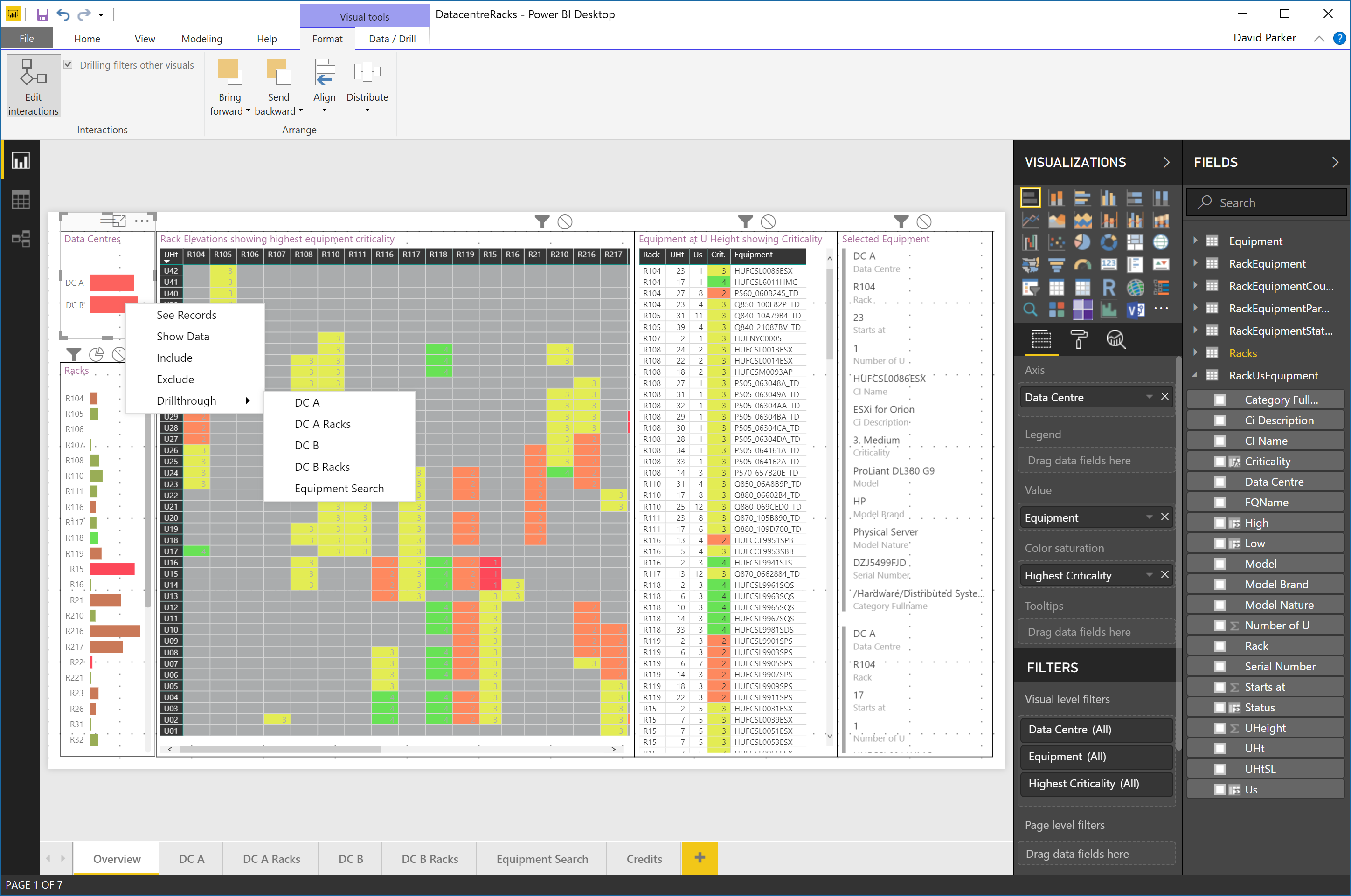
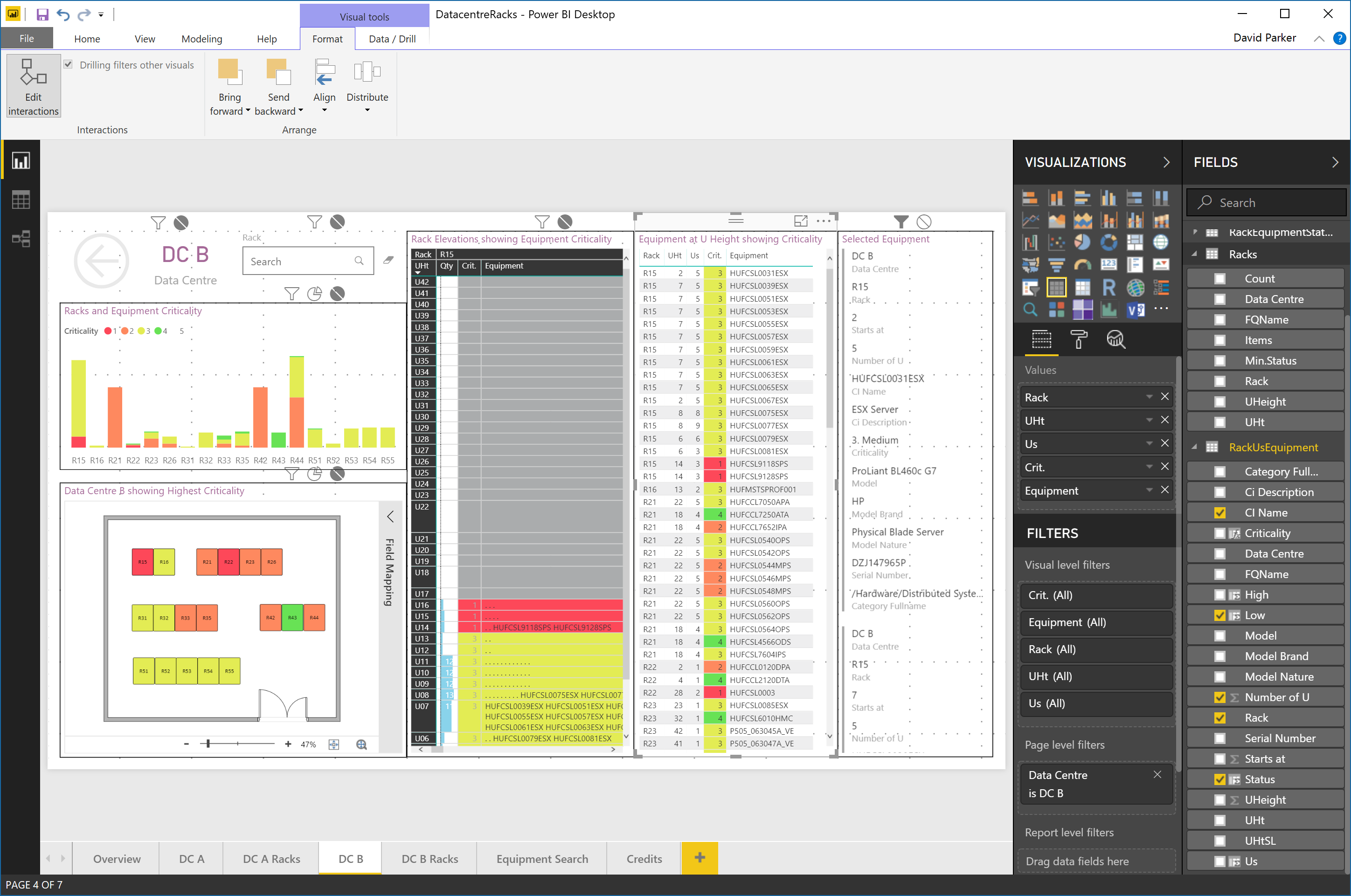
For one test, I used the standard Microsoft matrix custom visual to arrange the U heights vertically with the highest equipment criticality of the equipment at each U color-coded.

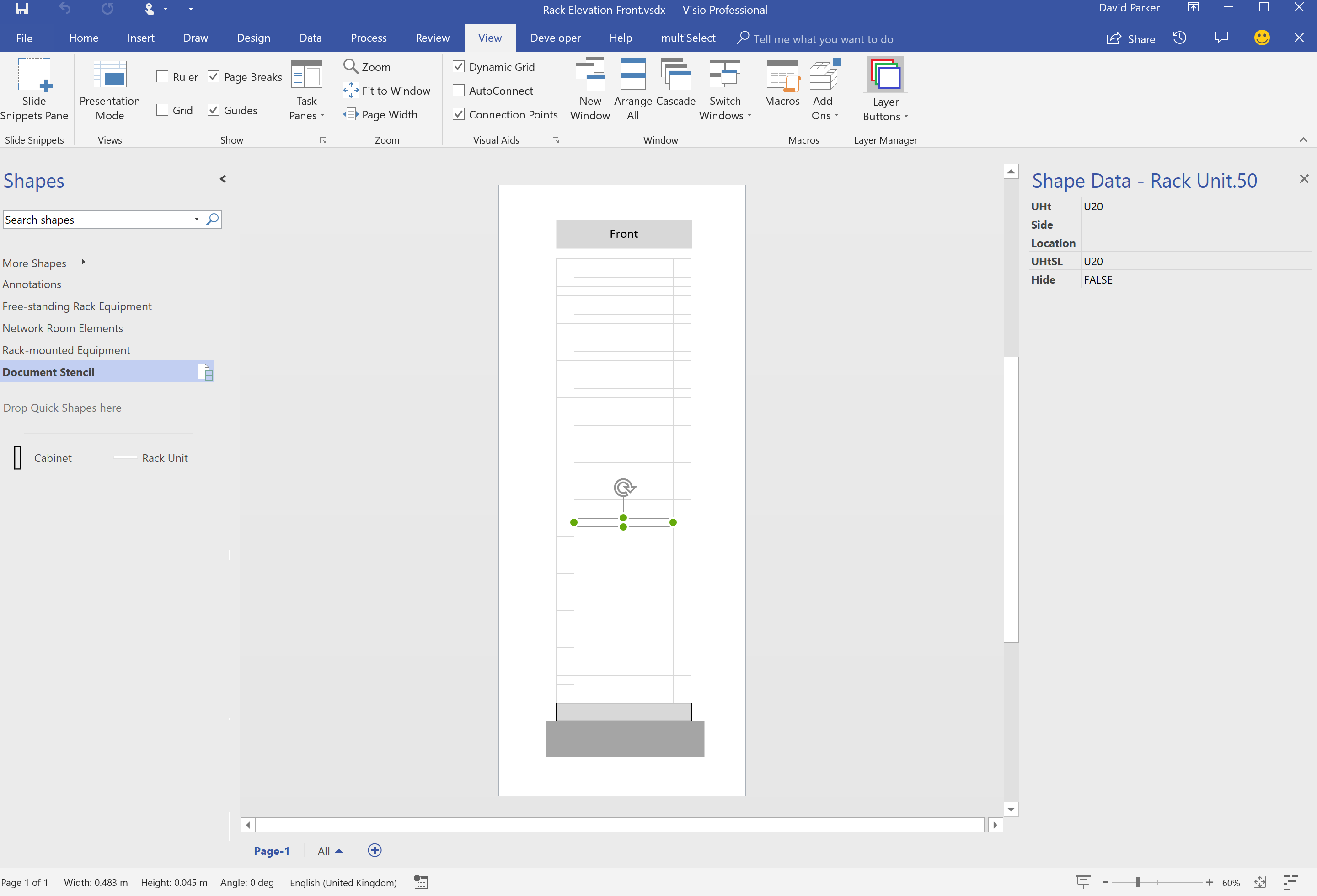
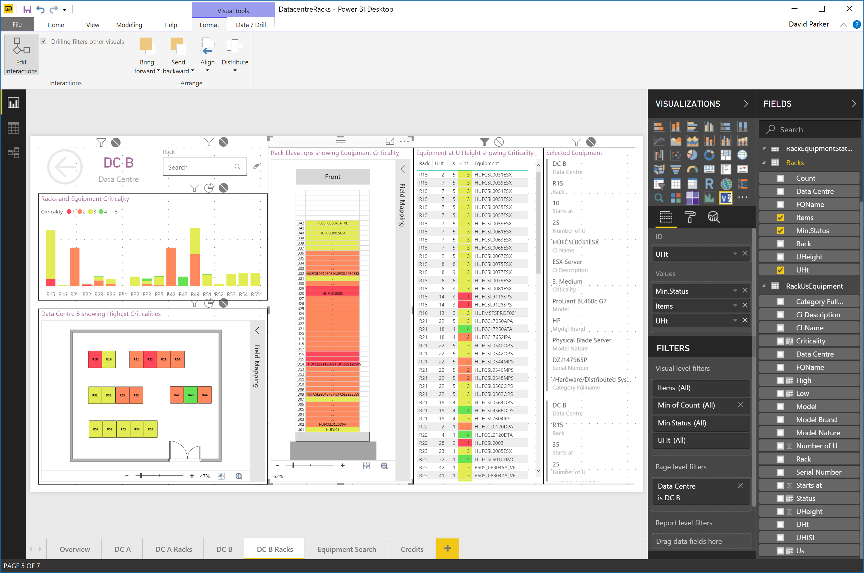
For the second test, I used the preview Visio custom visual of a blank rack elevation with just coded rectangles for each U height. I could then link the rack equipment summary data for each U height to each rectangle automatically, and color code the highest criticality again. I think the visual is more pleasing than the matrix, and of course I can zoom in on the graphic.

Well this was my experiment in creating a visual interactive report for data centres. The data can be maintained in Excel or another data source, and the rack elevations do not need to be maintained manually. Of course, the rack elevations are not using the near photo-realistic shapes that some third-party vendors offer, but it does focus the attention on the data, which is, after all, the whole reason for the report in he first place!
You can play with the experiment at Link to PowerBI example